VyStar Credit Union UX Design Internship
VyStar Credit Union
UX Design Internship
VyStar Credit Union
UX Design Internship
UI/UX Design | UX Research
As the sole User Experience Design Intern at VyStar Credit Union in Summer 2024, I not only worked on various products, such as the Online Mobile Banking Platform and the Customer Relationship Management System, but collaborated with Content Designers and Product Managers to deliver solutions to problems.


Details
June 2024 - August 2024
TIMELINE
Figma | Microsoft Office | Azure DevOps
TOOLS
User Experience Design Intern
ROLE
UI/UX Design | User Research
DISCIPLINES
My journey at VyStar Credit Union in Summer 2024 was not linear. Consequently, this won't be a typical case study. I was not given a project that was all encompassing and touched on most necessary skill sets as a UX Designer. Instead, I worked on various projects in smaller degrees. From the VyStar Design System to the Customer Relationship Management System to the Online Mobile Banking Platform to a Competitive Analysis. I worked on several different projects that each required their own unique skill sets. The
proceeding information will describe each of them.
My journey at VyStar Credit Union in Summer 2024 was not linear. Consequently, this won't be a typical case study. I was not given a project that was all encompassing and touched on most necessary skill sets as a UX Designer. Instead, I worked on various projects in smaller degrees. From the VyStar Design System to the Customer Relationship Management System to the Online Mobile Banking Platform to a Competitive Analysis. I worked on several different projects that each required their own unique skill sets. The proceeding information will describe each of them.
My journey at VyStar Credit Union in Summer 2024 was not linear. Consequently, this won't be a typical case study. I was not given a project that was all encompassing and touched on most necessary skill sets as a UX Designer. Instead, I worked on various projects in smaller degrees. From the VyStar Design System to the Customer Relationship Management System to the Online Mobile Banking Platform to a Competitive Analysis. I worked on several different projects that each required their own unique skill sets. The proceeding information will describe each of them.
My journey at VyStar Credit Union in Summer 2024 was not linear. Consequently, this won't be a typical case study. I was not given a project that was all encompassing and touched on most necessary skill sets as a UX Designer. Instead, I worked on various projects in smaller degrees. From the VyStar Design System to the Customer Relationship Management System to the Online Mobile Banking Platform to a Competitive Analysis. I worked on several different projects that each required their own unique skill sets. The proceeding information will describe each of them.
My journey at VyStar Credit Union in Summer 2024 was not linear. Consequently, this won't be a typical case study. I was not given a project that was all encompassing and touched on most necessary skill sets as a UX Designer. Instead, I worked on various projects in smaller degrees. From the VyStar Design System to the Customer Relationship Management System to the Online Mobile Banking Platform to a Competitive Analysis. I worked on several different projects that each required their own unique skill sets. The proceeding information will describe each of them.
My journey at VyStar Credit Union in Summer 2024 was not linear. Consequently, this won't be a typical case study. I was not given a project that was all encompassing and touched on most necessary skill sets as a UX Designer. Instead, I worked on various projects in smaller degrees. From the VyStar Design System to the Customer Relationship Management System to the Online Mobile Banking Platform to a Competitive Analysis. I worked on several different projects that each required their own unique skill sets. The proceeding information will describe each of them.
My journey at VyStar Credit Union in Summer 2024 was not linear. Consequently, this won't be a typical case study. I was not given a project that was all encompassing and touched on most necessary skill sets as a UX Designer. Instead, I worked on various projects in smaller degrees. From the VyStar Design System to the Customer Relationship Management System to the Online Mobile Banking Platform to a Competitive Analysis. I worked on several different projects that each required their own unique skill sets. The proceeding information will describe each of them.
My journey at VyStar Credit Union in Summer 2024 was not linear. Consequently, this won't be a typical case study. I was not given a project that was all encompassing and touched on most necessary skill sets as a UX Designer. Instead, I worked on various projects in smaller degrees. From the VyStar Design System to the Customer Relationship Management System to the Online Mobile Banking Platform to a Competitive Analysis. I worked on several different projects that each required their own unique skill sets. The proceeding information will describe each of them.
My journey at VyStar Credit Union in Summer 2024 was not linear. Consequently, this won't be a typical case study. I was not given a project that was all encompassing and touched on most necessary skill sets as a UX Designer. Instead, I worked on various projects in smaller degrees. From the VyStar Design System to the Customer Relationship Management System to the Online Mobile Banking Platform to a Competitive Analysis. I worked on several different projects that each required their own unique skill sets. The proceeding information will describe each of them.
Design System
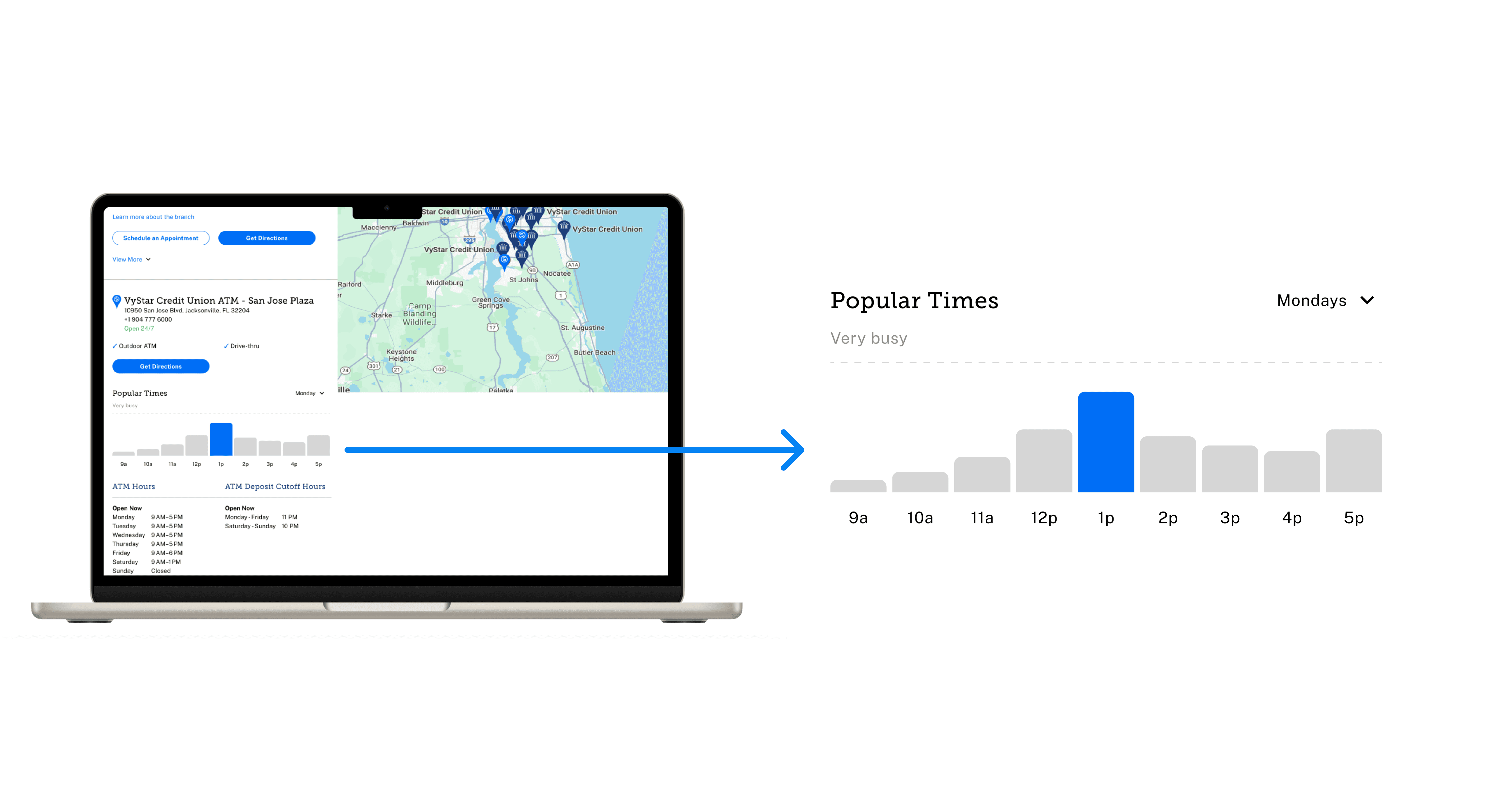
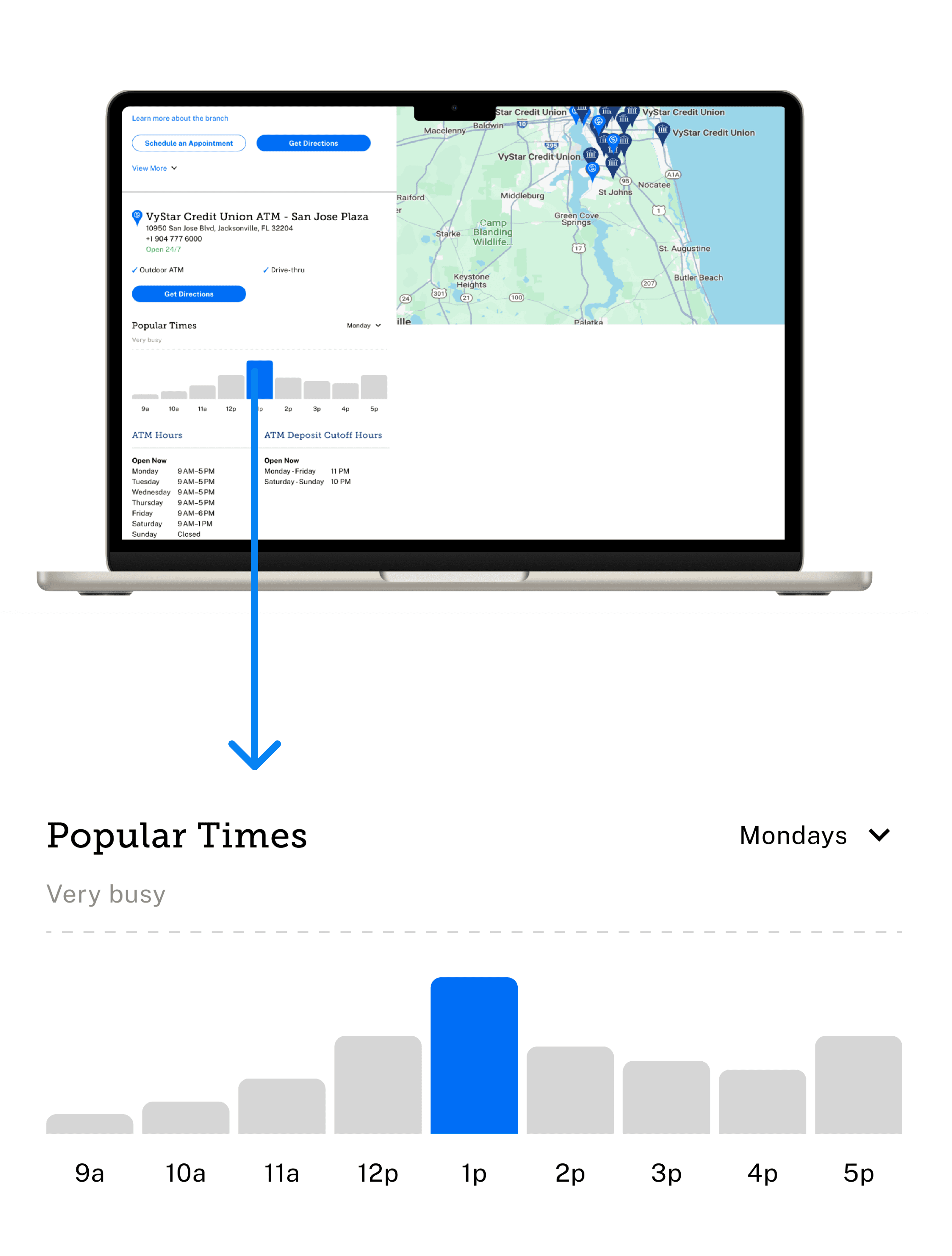
One of my goals going into my internship at VyStar was to gain experience maintaining and contributing to a design system. That being said, I am glad that I was able to accomplish this so early on in my internship. During a design review, I was shown a redesigned Branch Locations page for the website and asked if I had any suggestions. The designers were currently looking for some metric to allow members to know how busy a branch is. So, I suggested we add a bar chart as a visual representation of branch traffic to the redesigned branch locations page. This bar chart will empower members to better plan their visit to a branch by allowing them to know how busy a branch may be. I designed this component myself and it will be displayed onto the redesigned branch locations page.
One of my goals going into my internship at VyStar was to gain experience maintaining and contributing to a design system. That being said, I am glad that I was able to accomplish this so early on in my internship. During a design review, I was shown a redesigned Branch Locations page for the website and asked if I had any suggestions. The designers were currently looking for some metric to allow members to know how busy a branch is. So, I suggested we add a bar chart as a visual representation of branch traffic to the redesigned branch locations page. This bar chart will empower members to better plan their visit to a branch by allowing them to know how busy a branch may be. I designed this component myself and it will be displayed onto the redesigned branch locations page.
One of my goals going into my internship at VyStar was to gain experience maintaining and contributing to a design system. That being said, I am glad that I was able to accomplish this so early on in my internship. During a design review, I was shown a redesigned Branch Locations page for the website and asked if I had any suggestions. The designers were currently looking for some metric to allow members to know how busy a branch is. So, I suggested we add a bar chart as a visual representation of branch traffic to the redesigned branch locations page. This bar chart will empower members to better plan their visit to a branch by allowing them to know how busy a branch may be. I designed this component myself and it will be displayed onto the redesigned branch locations page.




Customer Relationship Management System
During the second week of my internship, I was given the role of lead UX Designer for the Customer Relationship Management System. This role entailed leading UX Design for the platform, communicating with the Product Manager and other stakeholders, and regularly collaborating with Content Design.
During the second week of my internship, I was given the role of lead UX Designer for the Customer Relationship Management System. This role entailed leading UX Design for the platform, communicating with the Product Manager and other stakeholders, and regularly collaborating with Content Design.
During the second week of my internship, I was given the role of lead UX Designer for the Customer Relationship Management System. This role entailed leading UX Design for the platform, communicating with the Product Manager and other stakeholders, and regularly collaborating with Content Design.
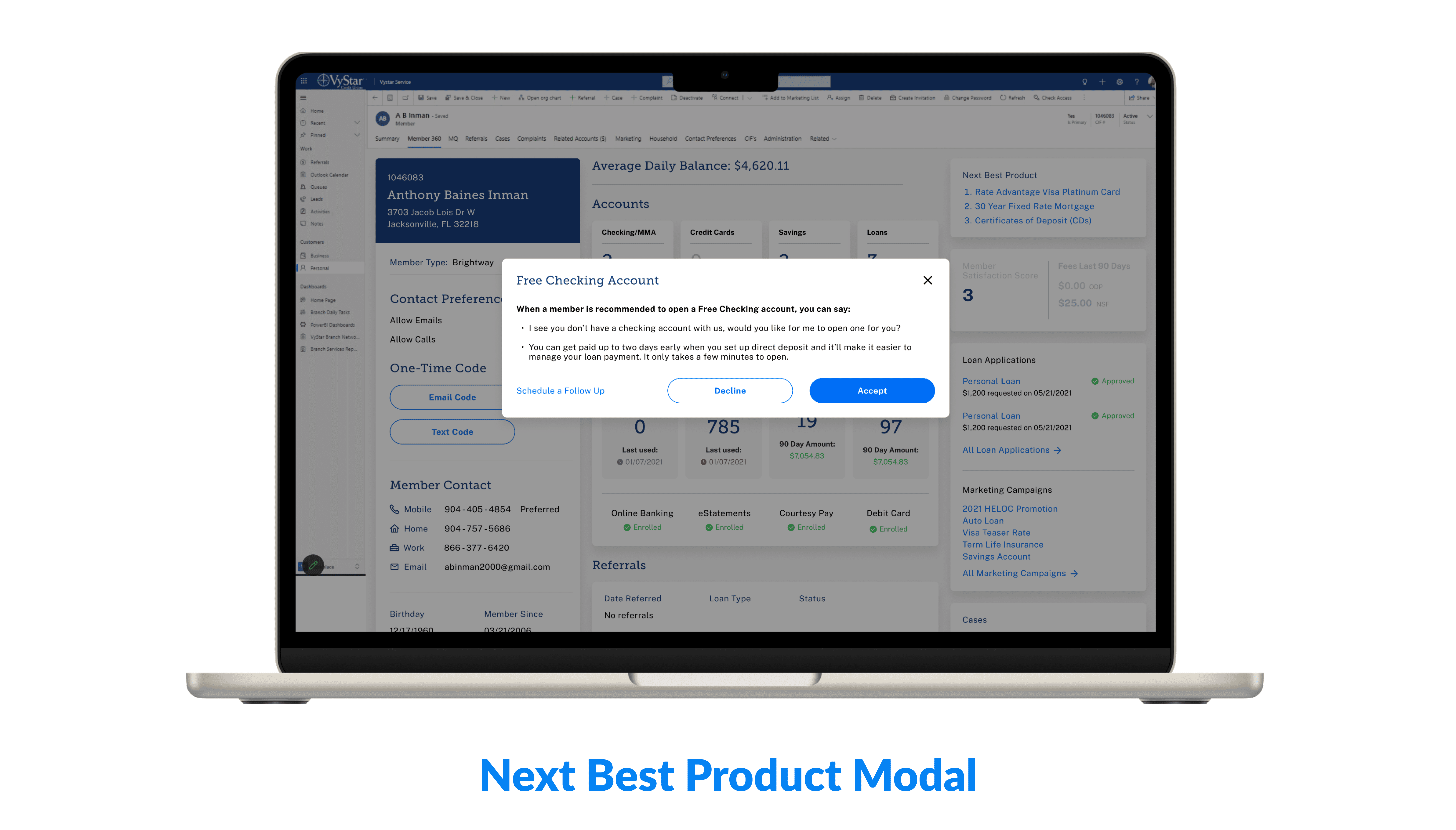


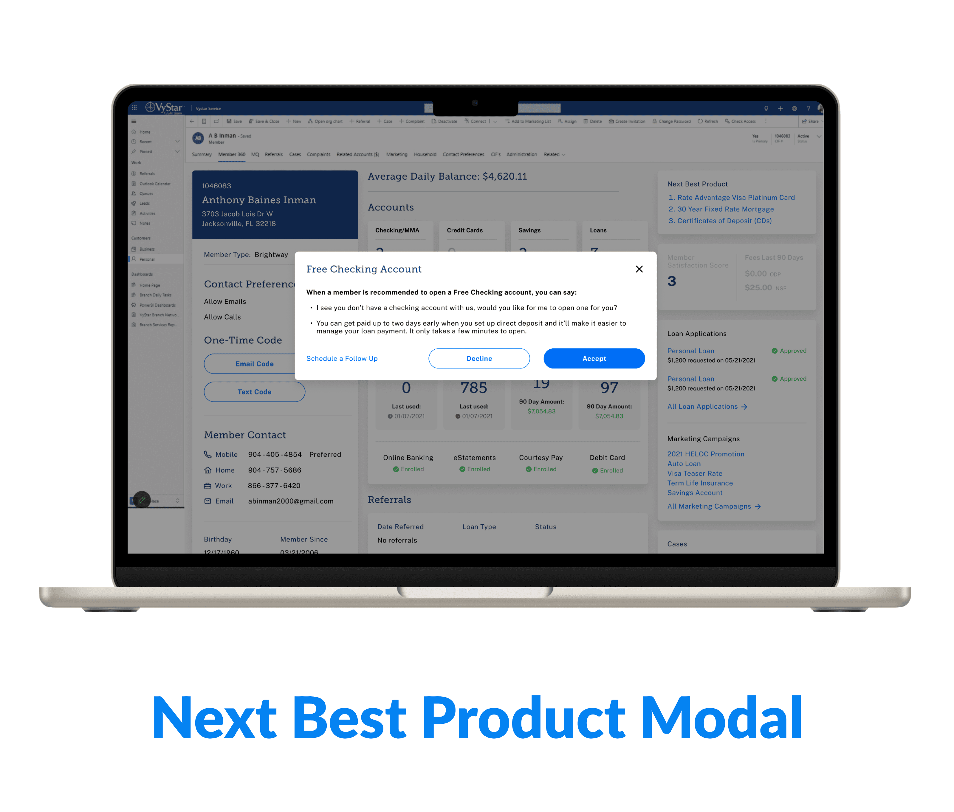


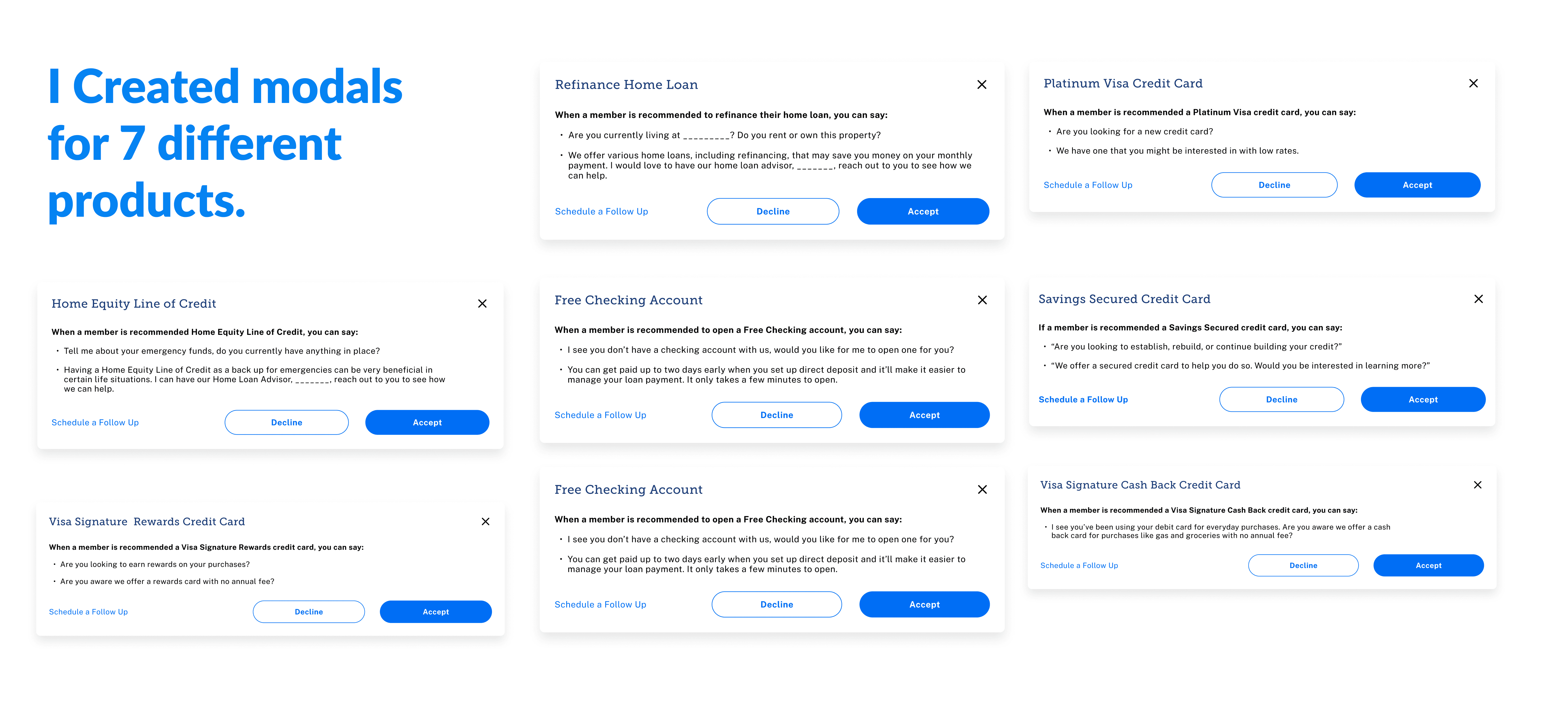
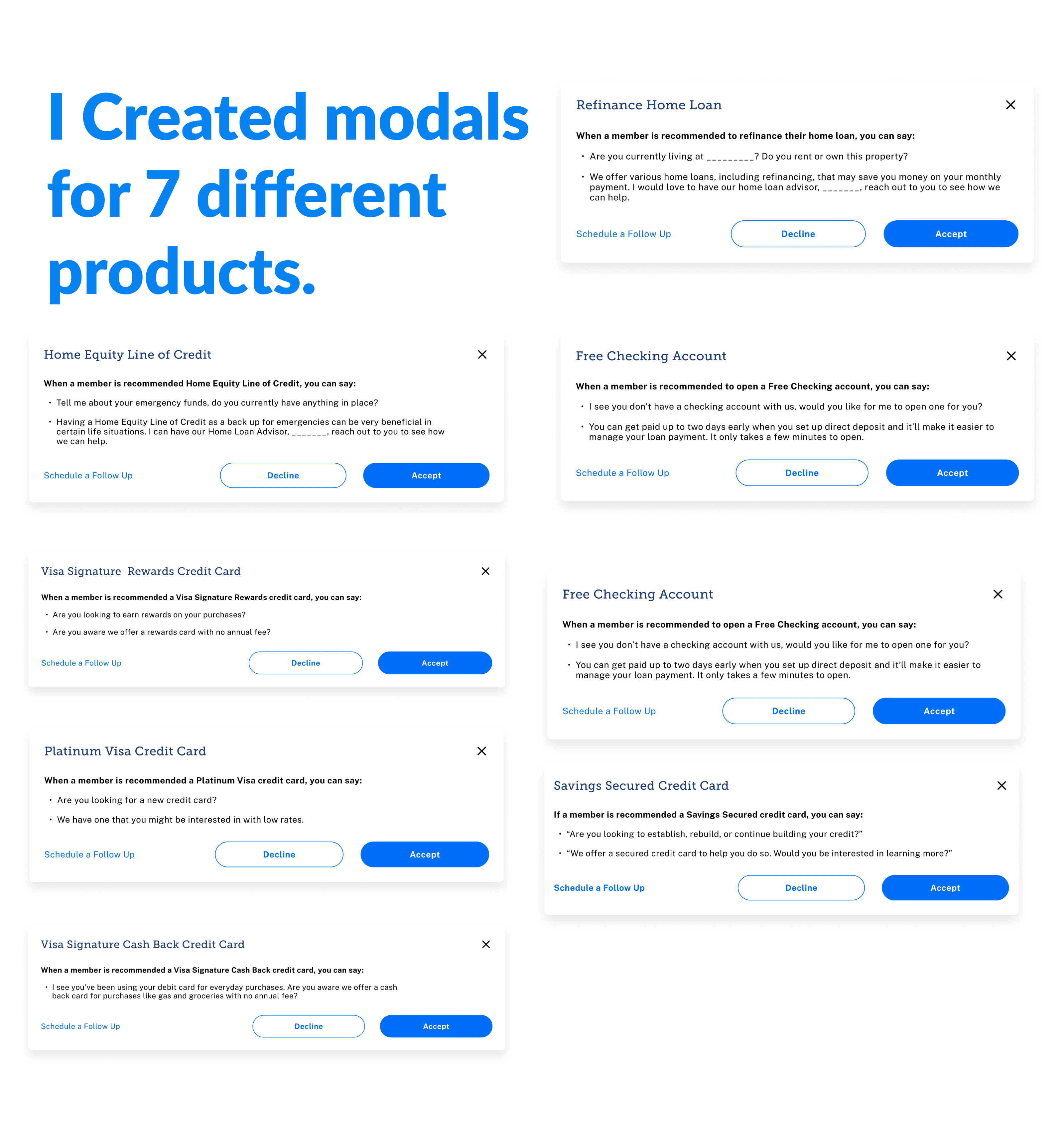
-Next Best Product Modal
One of the key things I worked on during my time as the UX lead for CRM was the Next Best Product Modal. The Next Best Product Modal allows branch representatives to easily market a new product to a member. The modal I designed has been handed off to the development team and will likely increase new product sales.
One of the key things I worked on during my time as the UX lead for CRM was the Next Best Product Modal. The Next Best Product Modal allows branch representatives to easily market a new product to a member. The modal I designed has been handed off to the development team and will likely increase new product sales.
One of the key things I worked on during my time as the UX lead for CRM was the Next Best Product Modal. The Next Best Product Modal allows branch representatives to easily market a new product to a member. The modal I designed has been handed off to the development team and will likely increase new product sales.




-Branch Research
One of my projects as UX lead for CRM was to conduct research on a redesigned landing page for CRM. Product wanted to have leads, tasks, and referrals displayed on this page and I wanted to make sure that these features would be useful to branch representatives and that they would not interfere with a branch rep's current understanding of the platform. In preparation for the branch visit, I prepared a Research Proposal and an Interview Guide.
One of my projects as UX lead for CRM was to conduct research on a redesigned landing page for CRM. Product wanted to have leads, tasks, and referrals displayed on this page and I wanted to make sure that these features would be useful to branch representatives and that they would not interfere with a branch rep's current understanding of the platform. In preparation for the branch visit, I prepared a Research Proposal and an Interview Guide.
One of my projects as UX lead for CRM was to conduct research on a redesigned landing page for CRM. Product wanted to have leads, tasks, and referrals displayed on this page and I wanted to make sure that these features would be useful to branch representatives and that they would not interfere with a branch rep's current understanding of the platform. In preparation for the branch visit, I prepared a Research Proposal and an Interview Guide.
However, when I arrived at the branch and began talking to branch representatives, I quickly learned that there was no need for my interview guide at all for they had little experience using CRM. Nevertheless, I continued my conversation with branch representatives and tried to learn all that I could about their experiences so I could glean useful insights.
However, when I arrived at the branch and began talking to branch representatives, I quickly learned that there was no need for my interview guide at all for they had little experience using CRM. Nevertheless, I continued my conversation with branch representatives and tried to learn all that I could about their experiences so I could glean useful insights.
However, when I arrived at the branch and began talking to branch representatives, I quickly learned that there was no need for my interview guide at all for they had little experience using CRM. Nevertheless, I continued my conversation with branch representatives and tried to learn all that I could about their experiences so I could glean useful insights.
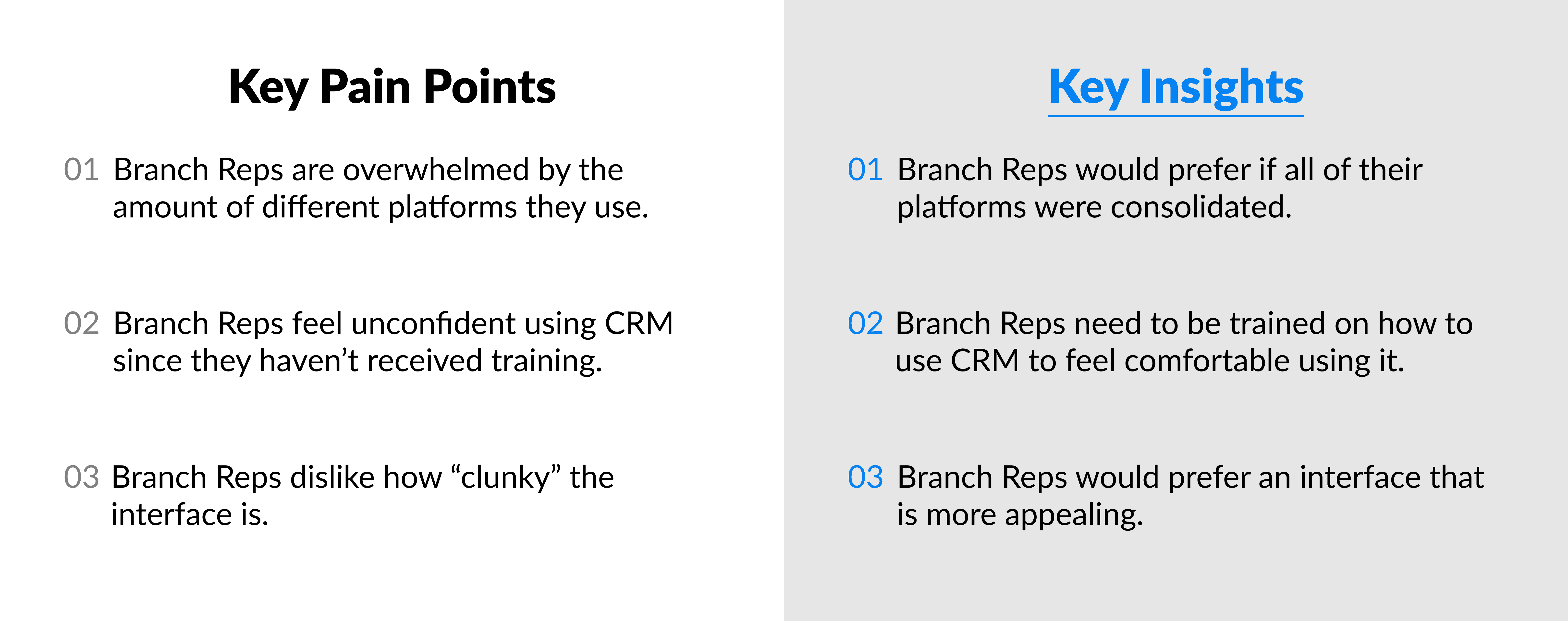




Overall, my research unveiled that Branch Representatives had little to no knowledge of how to use CRM. I believe that my findings will inform how Product chooses to approach the deployment of CRM as well as how UX chooses to redesign the platform.
Overall, my research unveiled that Branch Representatives had little to no knowledge of how to use CRM. I believe that my findings will inform how Product chooses to approach the deployment of CRM as well as how UX chooses to redesign the platform.
Overall, my research unveiled that Branch Representatives had little to no knowledge of how to use CRM. I believe that my findings will inform how Product chooses to approach the deployment of CRM as well as how UX chooses to redesign the platform.
Online Mobile Banking
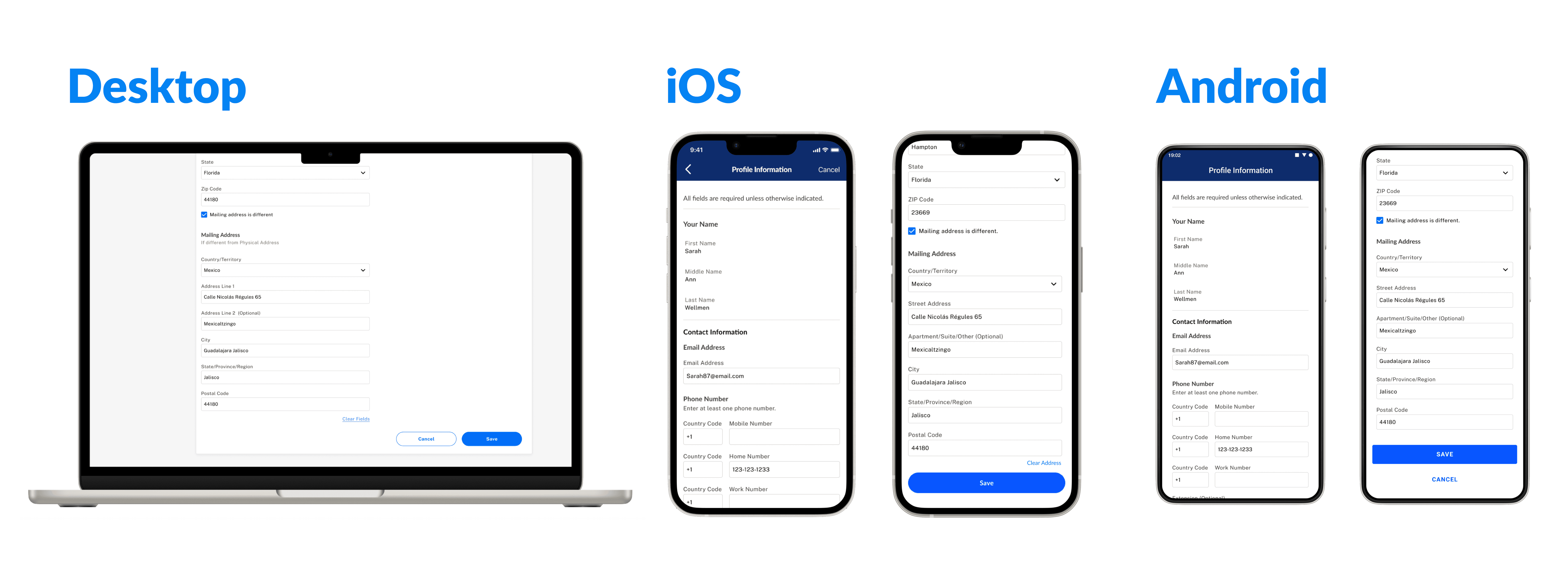
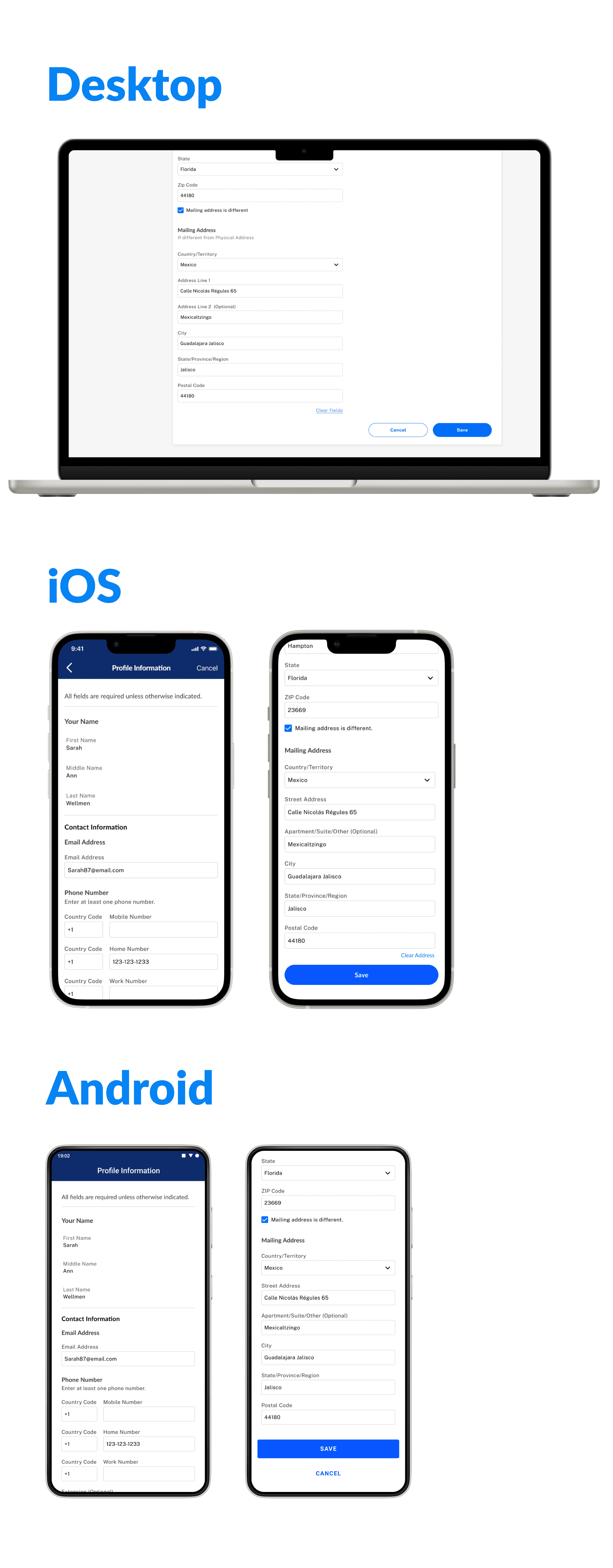
Towards the end of my internship I was given a work item created by the Product Manager for Online Mobile Banking (OMB) to make some updates to the Mailing Address and Profile settings page for Physical and Mailing address as well as add 'clear address' functionality for the Mailing Address on OMB . However, the other UX Designers and I felt that adding this functionality was unnecessary and would detract from the desired experience.
Towards the end of my internship I was given a work item created by the Product Manager for Online Mobile Banking (OMB) to make some updates to the Mailing Address and Profile settings page for Physical and Mailing address as well as add 'clear address' functionality for the Mailing Address on OMB . However, the other UX Designers and I felt that adding this functionality was unnecessary and would detract from the desired experience.
Towards the end of my internship I was given a work item created by the Product Manager for Online Mobile Banking (OMB) to make some updates to the Mailing Address and Profile settings page for Physical and Mailing address as well as add 'clear address' functionality for the Mailing Address on OMB . However, the other UX Designers and I felt that adding this functionality was unnecessary and would detract from the desired experience.




I attempted to explain my reasoning behind my design decision to the Product Manager over teams, however, it was difficult to reach a consensus so the two of us agreed to arrange a meeting. I next reached out the Product Manager for UX Design and she was able to set up a meeting between me, the rest of the UX team, the Product Manager for Online Mobile Banking (OMB) and the Product Manager for Online Account Opening (OAO).
I attempted to explain my reasoning behind my design decision to the Product Manager over teams, however, it was difficult to reach a consensus so the two of us agreed to arrange a meeting. I next reached out the Product Manager for UX Design and she was able to set up a meeting between me, the rest of the UX team, the Product Manager for Online Mobile Banking (OMB) and the Product Manager for Online Account Opening (OAO).
I attempted to explain my reasoning behind my design decision to the Product Manager over teams, however, it was difficult to reach a consensus so the two of us agreed to arrange a meeting. I next reached out the Product Manager for UX Design and she was able to set up a meeting between me, the rest of the UX team, the Product Manager for Online Mobile Banking (OMB) and the Product Manager for Online Account Opening (OAO).
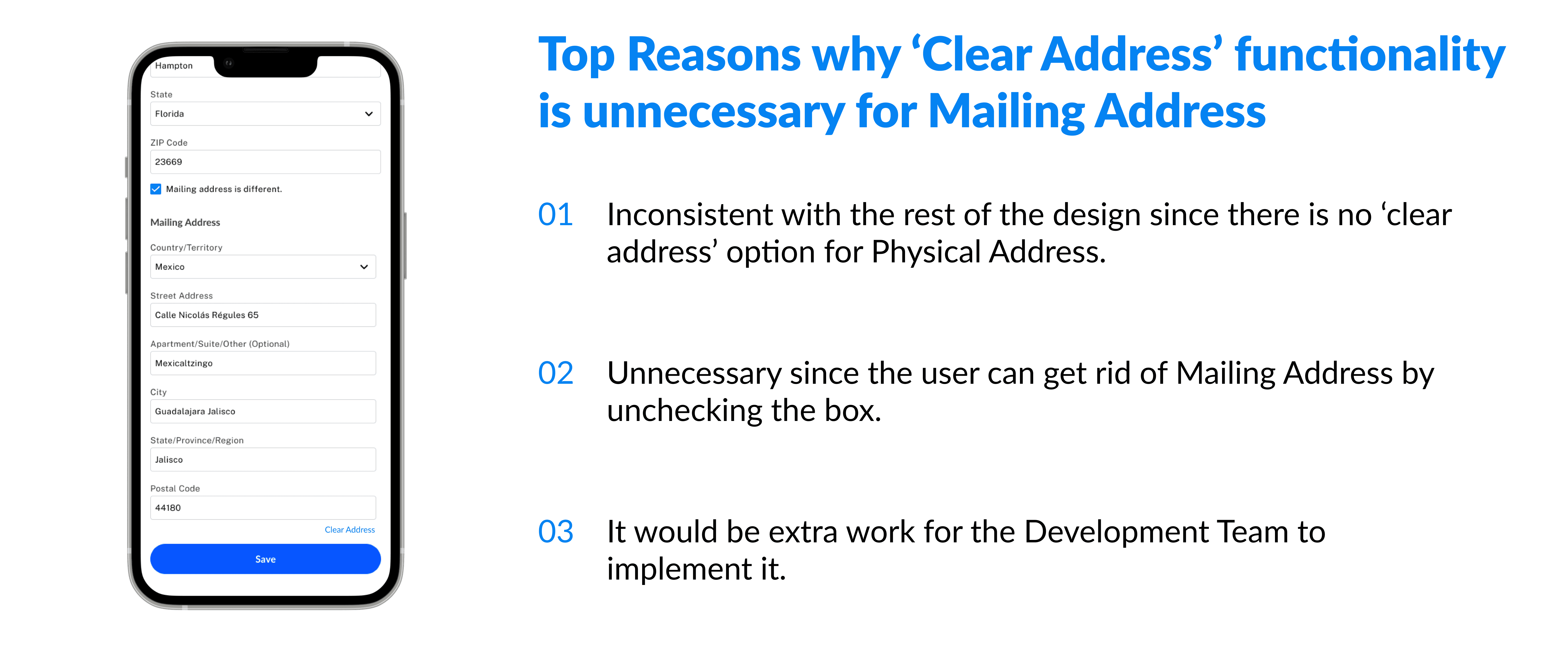
I drove the meeting and was able to successfully articulate the rationale behind my design decision to the PM for OMB. I convinced her of my design decision using the reasoning in the graphic above. Additionally, I pointed out any discrepancies between the two platforms, OAO and OMB, for Profile Settings for Physical and Mailing Address. After a productive meeting, my next step was to create designs for Desktop, Mobile Web, iOS, and Android breakpoints for the other updates to the OMB Platform.
I drove the meeting and was able to successfully articulate the rationale behind my design decision to the PM for OMB. I convinced her of my design decision using the reasoning in the graphic above. Additionally, I pointed out any discrepancies between the two platforms, OAO and OMB, for Profile Settings for Physical and Mailing Address. After a productive meeting, my next step was to create designs for Desktop, Mobile Web, iOS, and Android breakpoints for the other updates to the OMB Platform.
I drove the meeting and was able to successfully articulate the rationale behind my design decision to the PM for OMB. I convinced her of my design decision using the reasoning in the graphic above. Additionally, I pointed out any discrepancies between the two platforms, OAO and OMB, for Profile Settings for Physical and Mailing Address. After a productive meeting, my next step was to create designs for Desktop, Mobile Web, iOS, and Android breakpoints for the other updates to the OMB Platform.




Competitve Analysis and Dashboard Design
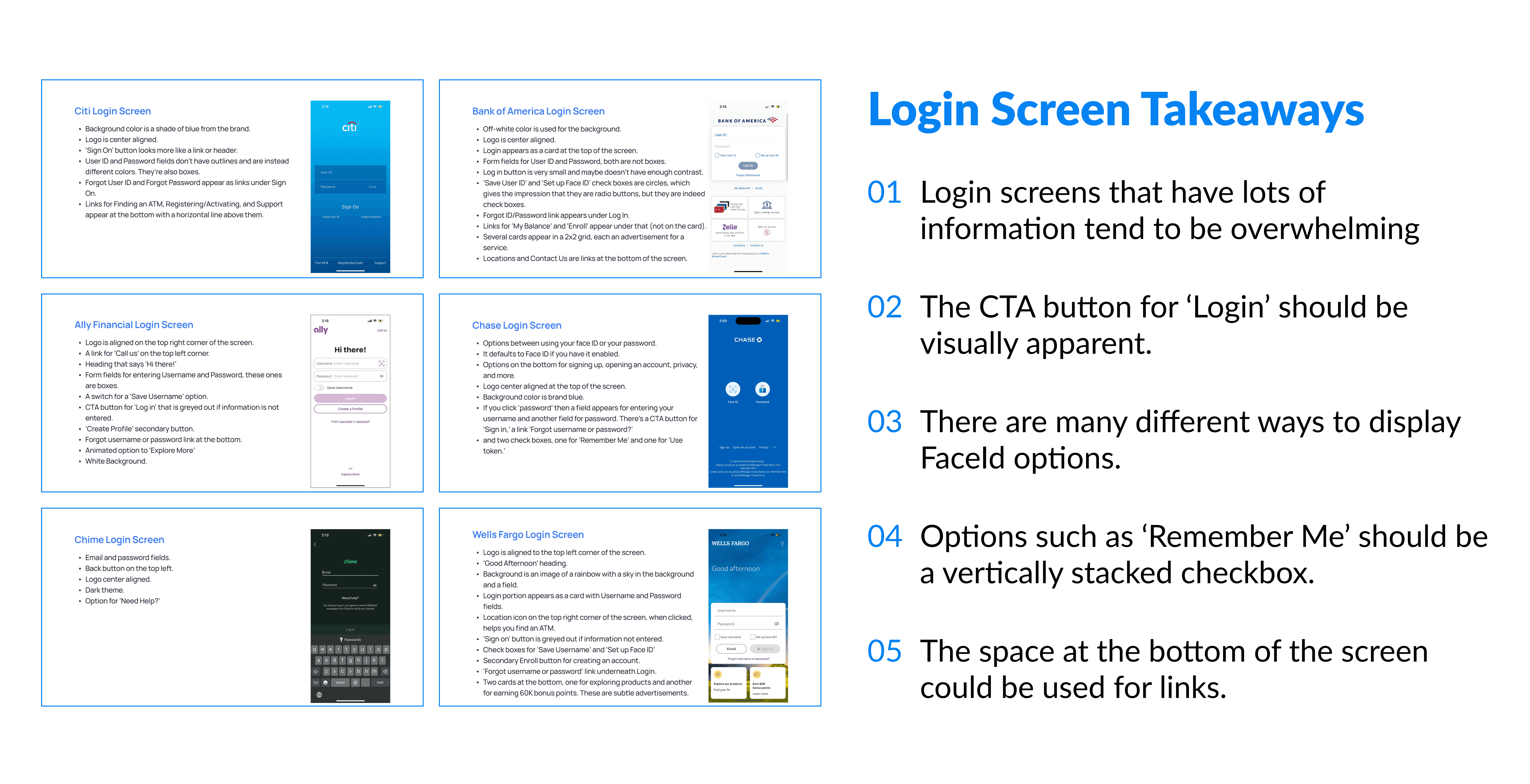
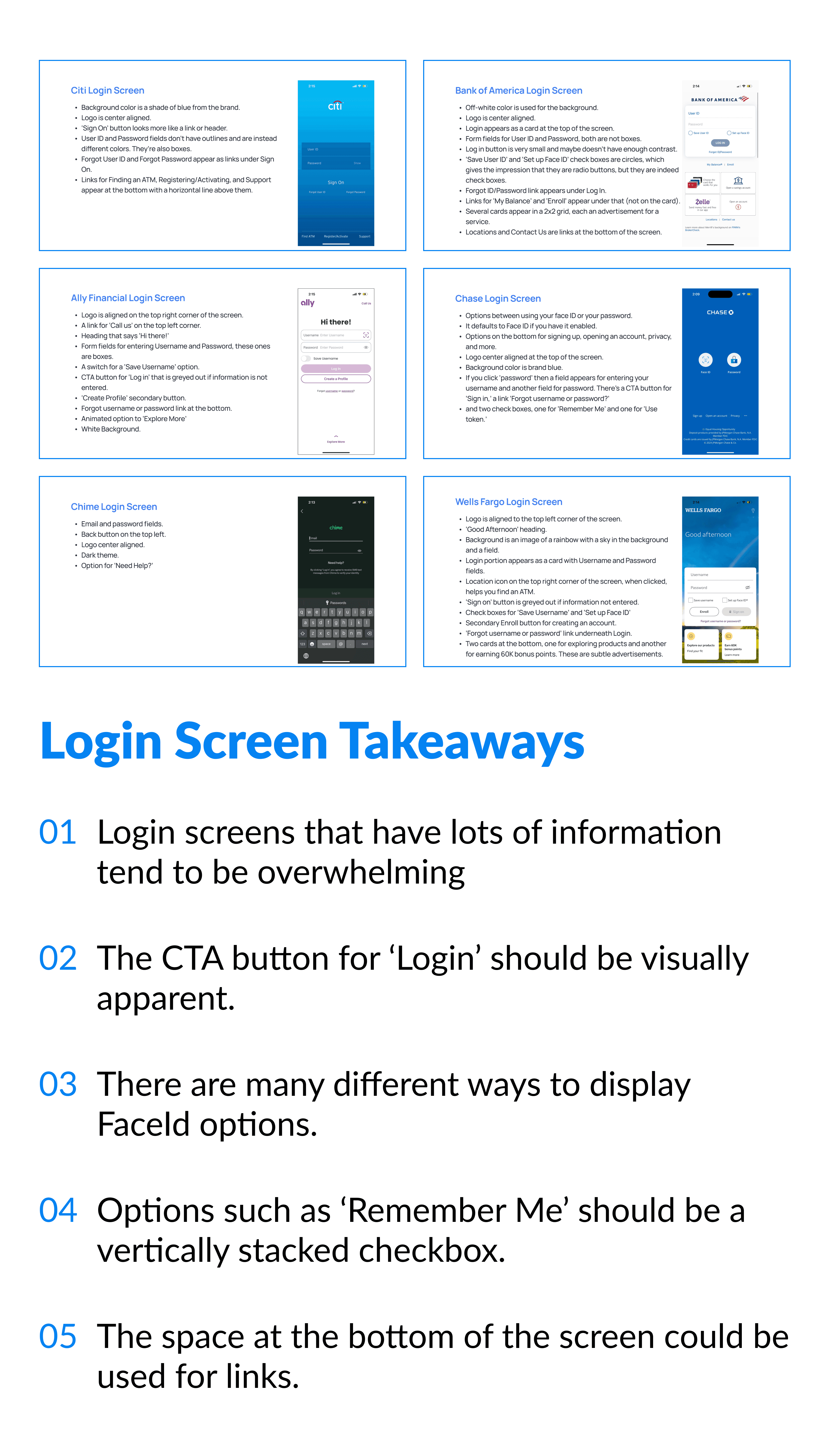
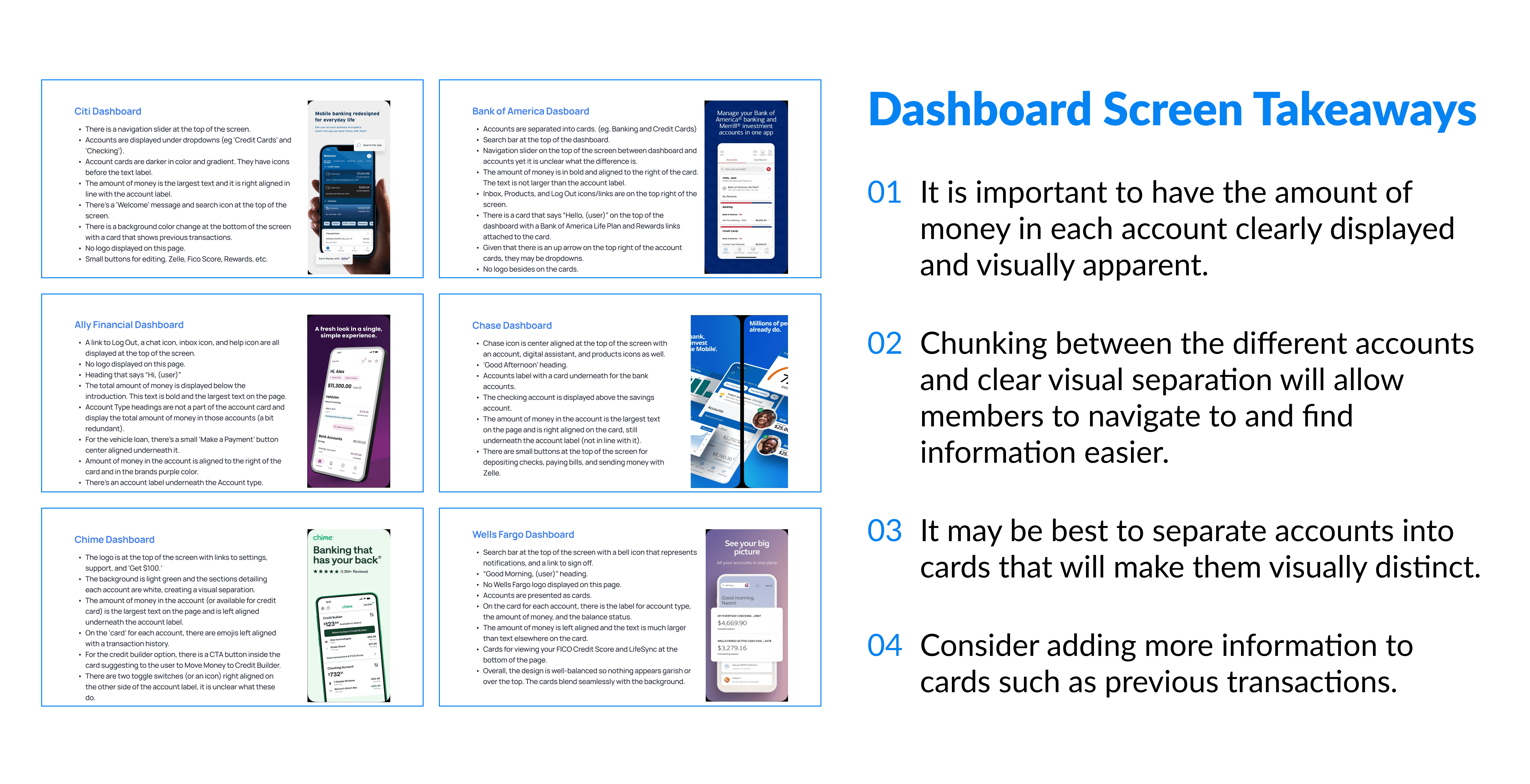
I conducted a Competitive Analysis for the potential redesign of the Login and Dashboard screens for the VyStar mobile banking app. To do this, I evaluated the designs of several mobile banking apps, compared them, created a presentation, then presented these findings to the UX & Analytics team.
I conducted a Competitive Analysis for the potential redesign of the Login and Dashboard screens for the VyStar mobile banking app. To do this, I evaluated the designs of several mobile banking apps, compared them, created a presentation, then presented these findings to the UX & Analytics team.
I conducted a Competitive Analysis for the potential redesign of the Login and Dashboard screens for the VyStar mobile banking app. To do this, I evaluated the designs of several mobile banking apps, compared them, created a presentation, then presented these findings to the UX & Analytics team.
I conducted a Competitive Analysis for the potential redesign of the Login and Dashboard screens for the VyStar mobile banking app. To do this, I evaluated the designs of several mobile banking apps, compared them, created a presentation, then presented these findings to the UX & Analytics team.




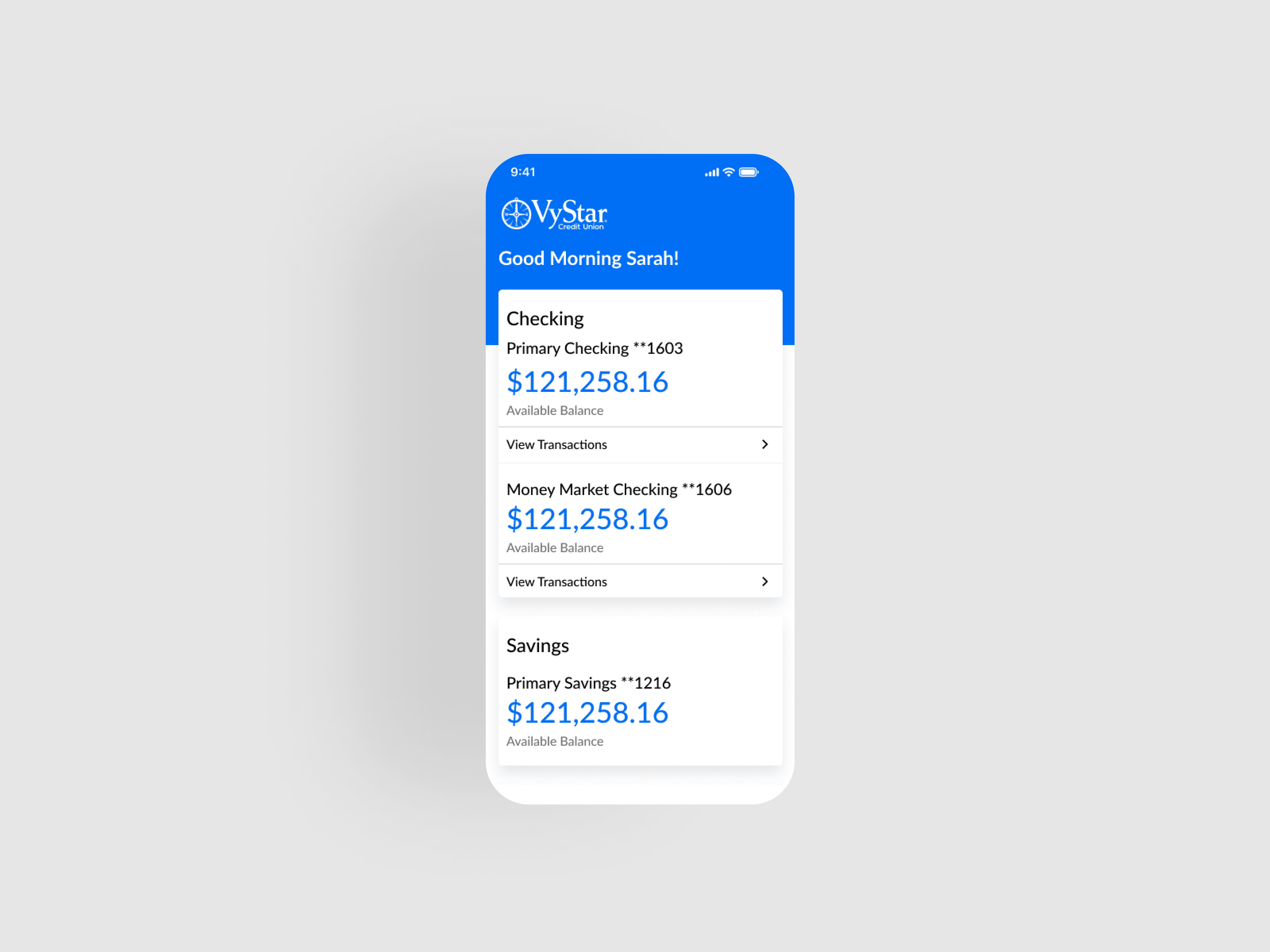
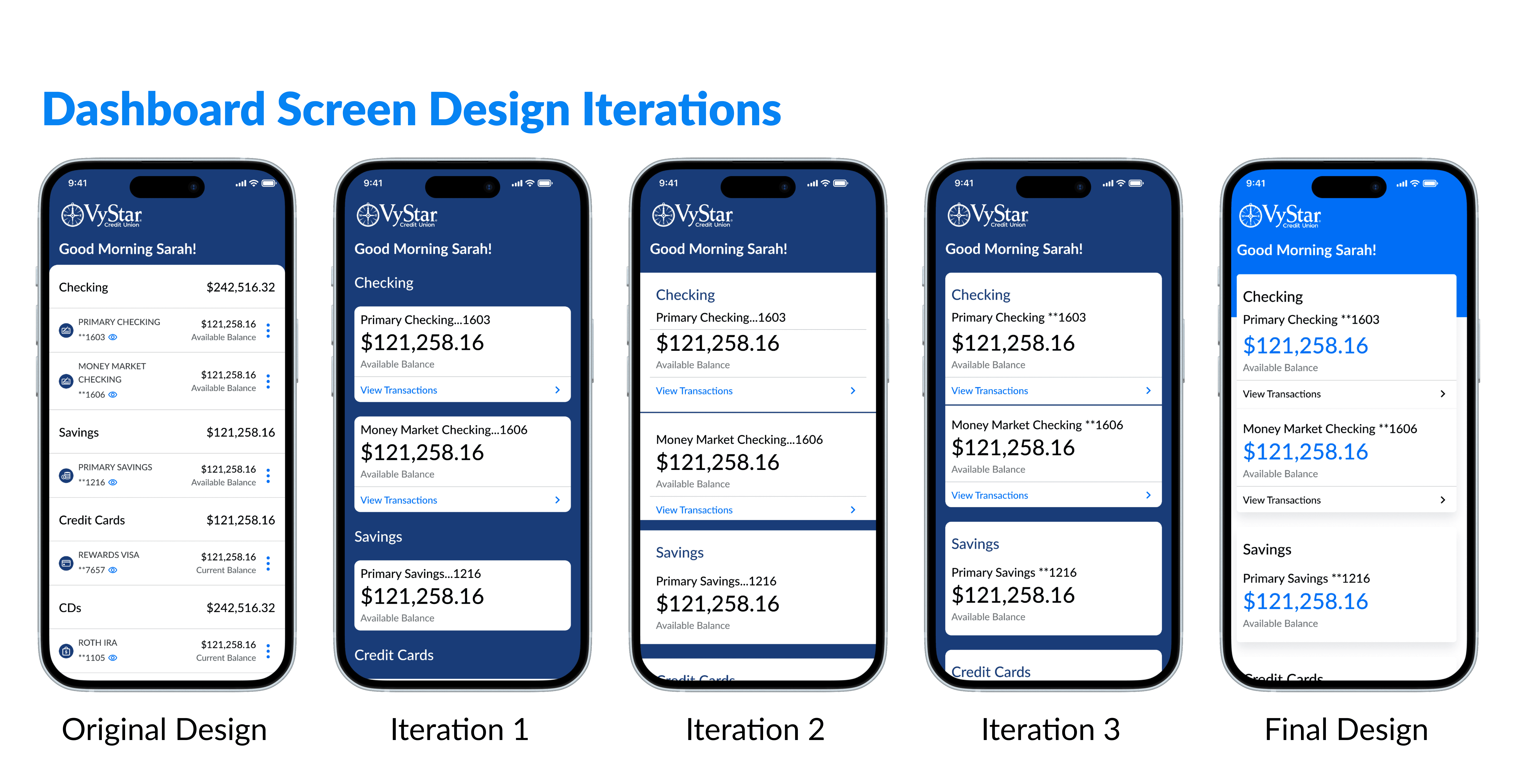
After reviewing my findings for Login and Dashboard screen designs, I decided to conduct a design exploration of a redesigned dashboard for VyStar's mobile banking app seeing as there was a lot more room for improvement with that particular screen. The current VyStar dashboard is very compressed. It does not make use of chunking, does not clearly display the amount of money in each account, and has a somewhat clunky visual design. I focused on remediating these issues in my design exploration. I believe that my design exploration will be able to serve as a basis for a potential redesigned VyStar mobile banking app in the future.
After reviewing my findings for Login and Dashboard screen designs, I decided to conduct a design exploration of a redesigned dashboard for VyStar's mobile banking app seeing as there was a lot more room for improvement with that particular screen. The current VyStar dashboard is very compressed. It does not make use of chunking, does not clearly display the amount of money in each account, and has a somewhat clunky visual design. I focused on remediating these issues in my design exploration. I believe that my design exploration will be able to serve as a basis for a potential redesigned VyStar mobile banking app in the future.
After reviewing my findings for Login and Dashboard screen designs, I decided to conduct a design exploration of a redesigned dashboard for VyStar's mobile banking app seeing as there was a lot more room for improvement with that particular screen. The current VyStar dashboard is very compressed. It does not make use of chunking, does not clearly display the amount of money in each account, and has a somewhat clunky visual design. I focused on remediating these issues in my design exploration. I believe that my design exploration will be able to serve as a basis for a potential redesigned VyStar mobile banking app in the future.






Learnings and Takeaways
Over the course of my internship I learned extensively about how UX Design fits into a business. Some of my takeaways and learnings are:
The importance of a design system. Over the course of my internship I learned that it is very important to have a design system for all the products. This not only creates a cohesive experience for the user but for designers and developers as well as it is much easier for us to work and create new designs when using components from a preexisting design system.
Advanced Figma tools. I gained much more experience using advanced Figma tools such as auto-layout, components, variables, and booleans. Overall, I feel much more confident using these tools now and can say that I've now become a fan of auto-layout.
The art of communication. I learned how important it is to communicate across teams and with people who don't share your job function. I also learned how to successfully work with Product Managers and Content Designers.
Agile workflow. I learned about how to use Azure DevOps and work within an Agile workflow. I also achieved proficiency Microsoft Office Suite.
