NOAA Website Redesign
UI/UX Design | Visual Design
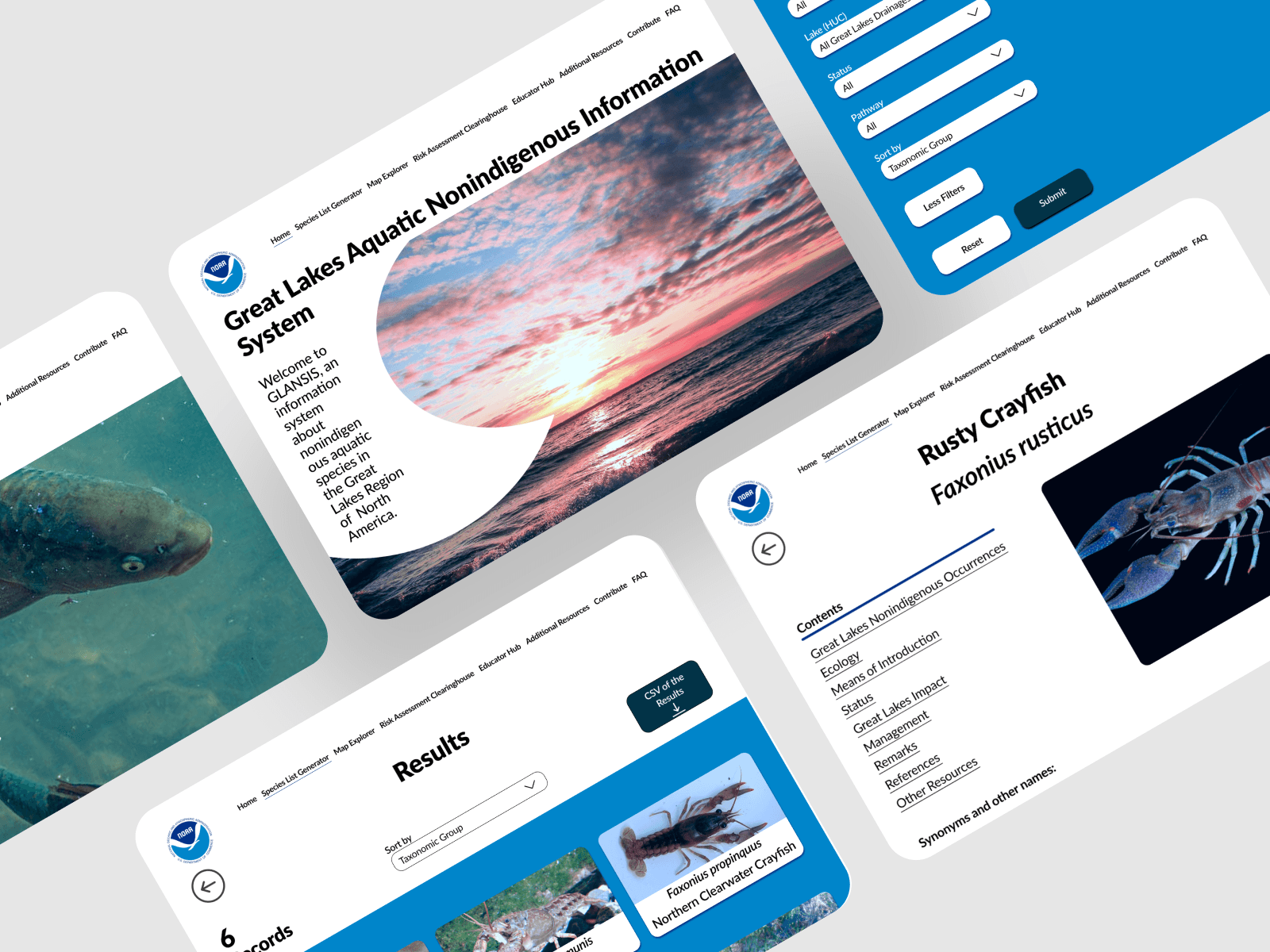
A redesign for the National Oceanic and Atmospheric Association's Great Lakes Aquatic Nonindigenous Species Information System's Species List Generator tool intended to reduce confusion, increase flexibility, and improve upon the visual design.
A project for Intro to UX.
Details
October 2023-December 2023
TIMELINE
Figma
TOOLS
Solo UX Designer
ROLE
UI/UX Design | Visual Design
DISCIPLINES
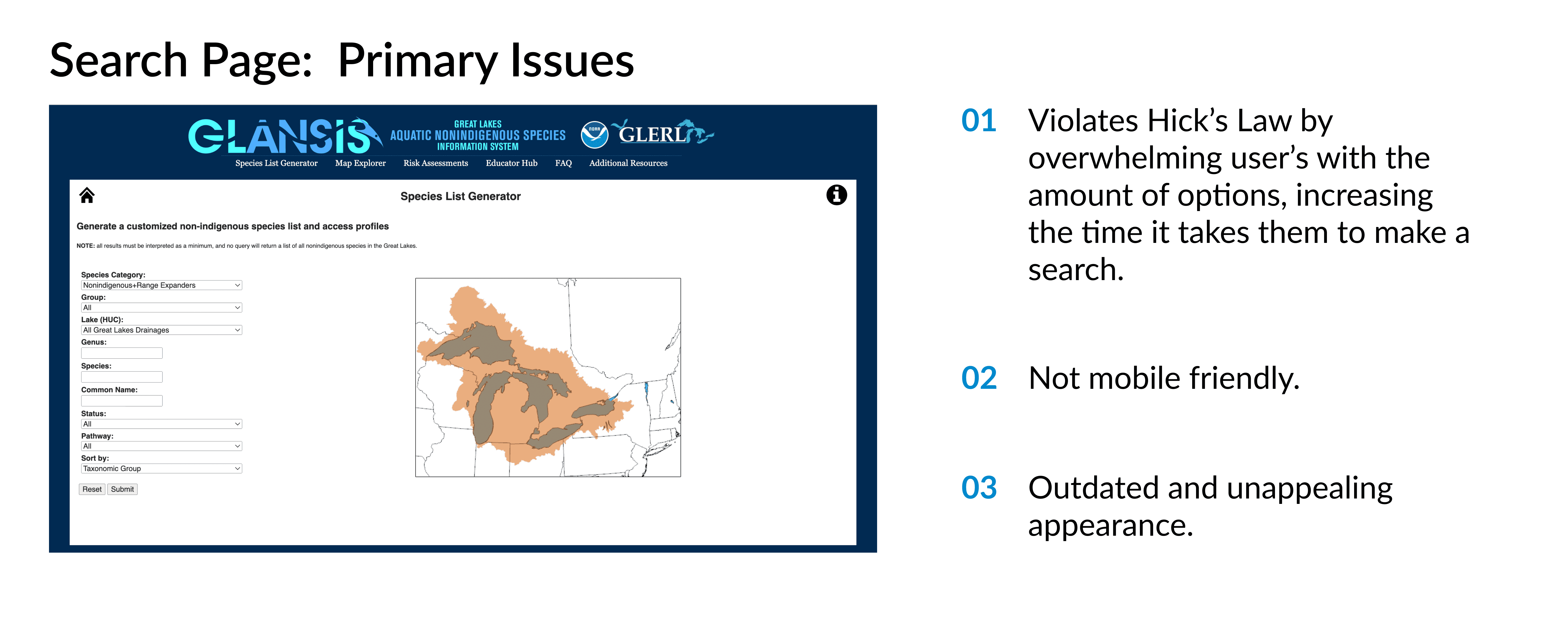
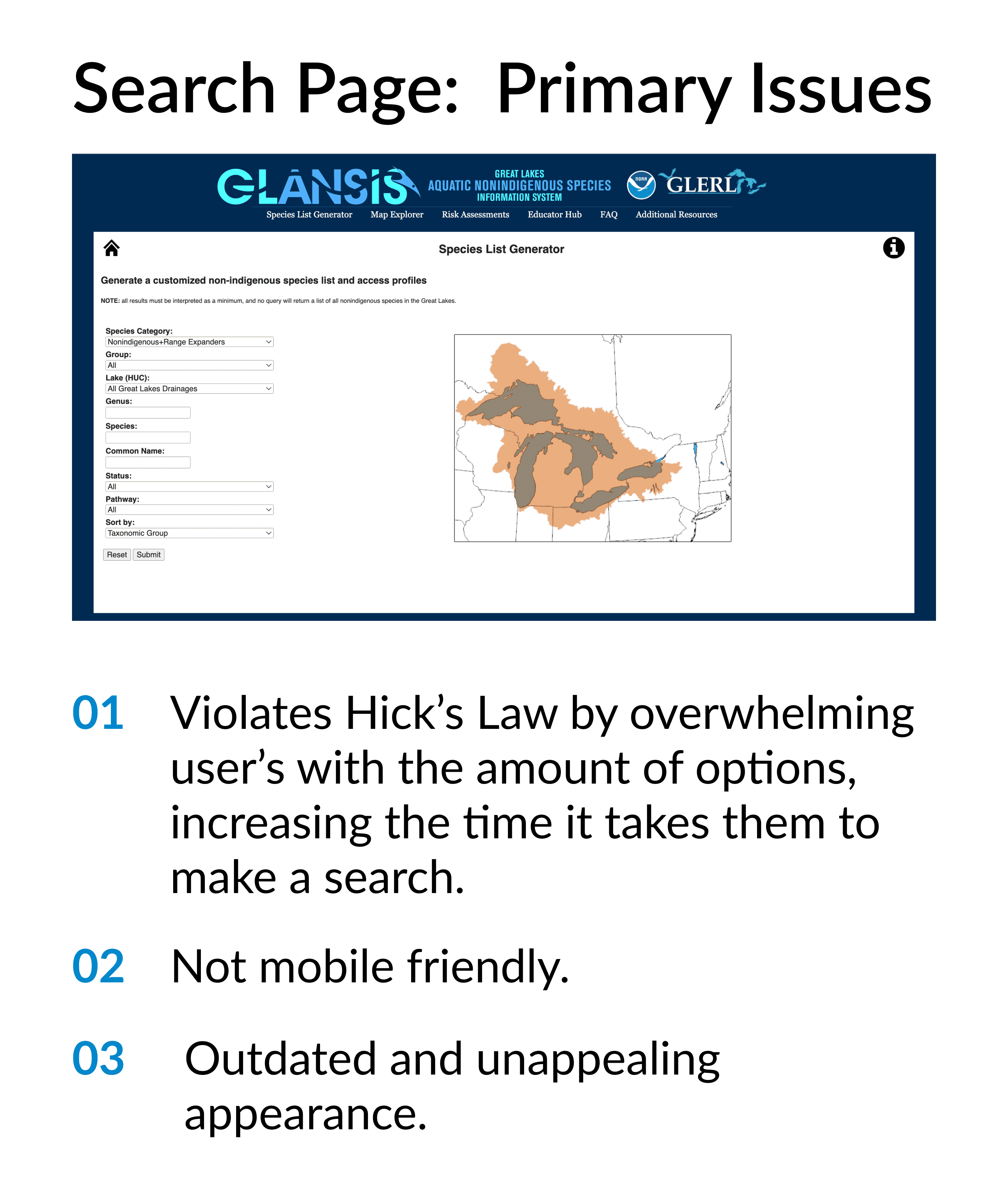
The Great Lakes Aquatic Nonindigenous Species Information System (GLANSIS) is a website owned by NOAA that houses an online database of nonindigenous species in the great lakes. The website is primarily used by managers, researchers, and educators. The Species List Generator is a feature on the site that allows one to search for a species. GLANSIS's layout and visual design have not been updated since the site was created about 20 years ago. This complex and ineffectual design makes it difficult for users to navigate the site and find information that is relevant to them. NOAA are looking to redesign GLANSIS to remedy these issues.
Challenge
Audit
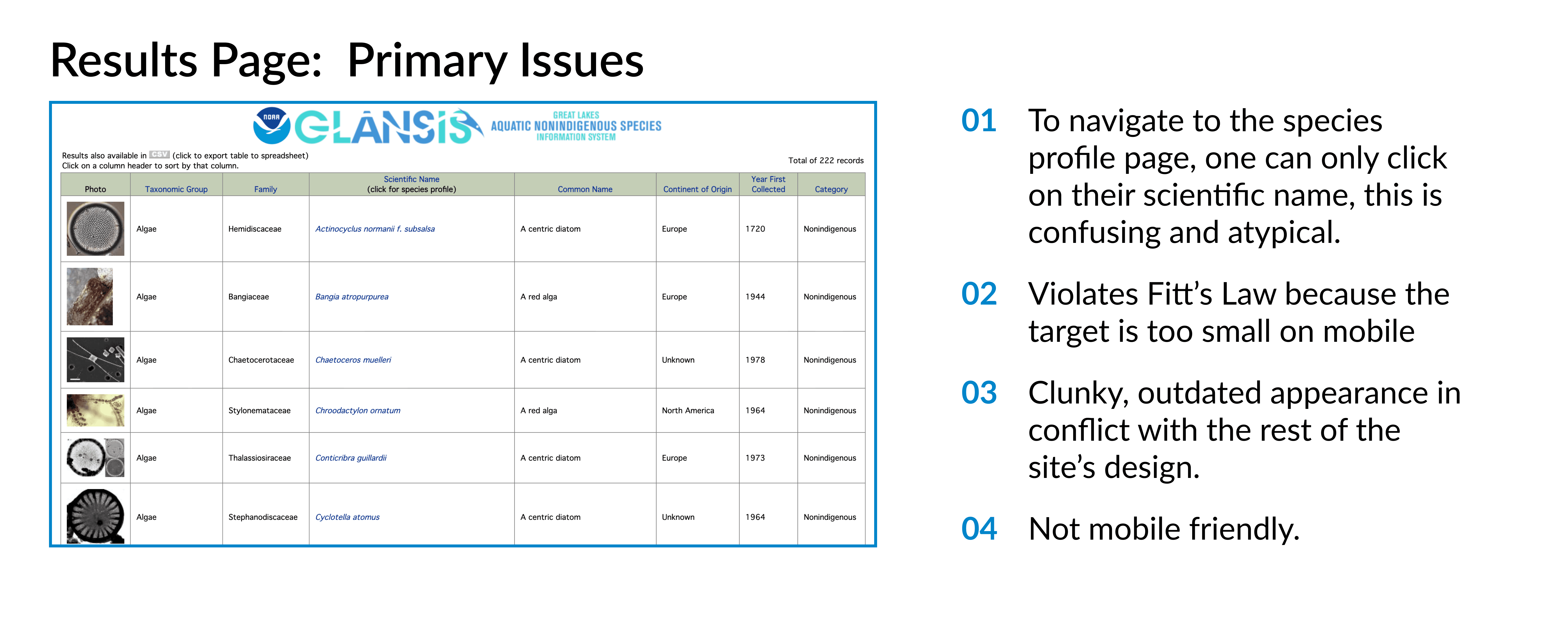
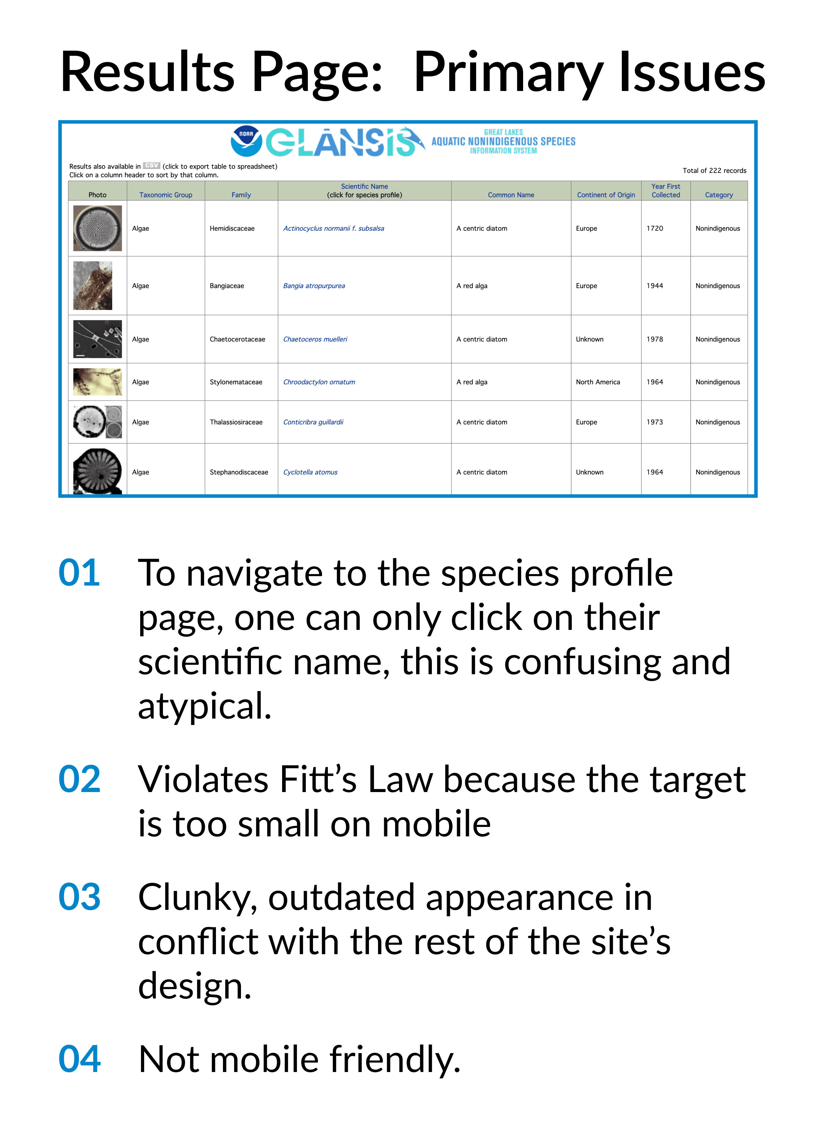
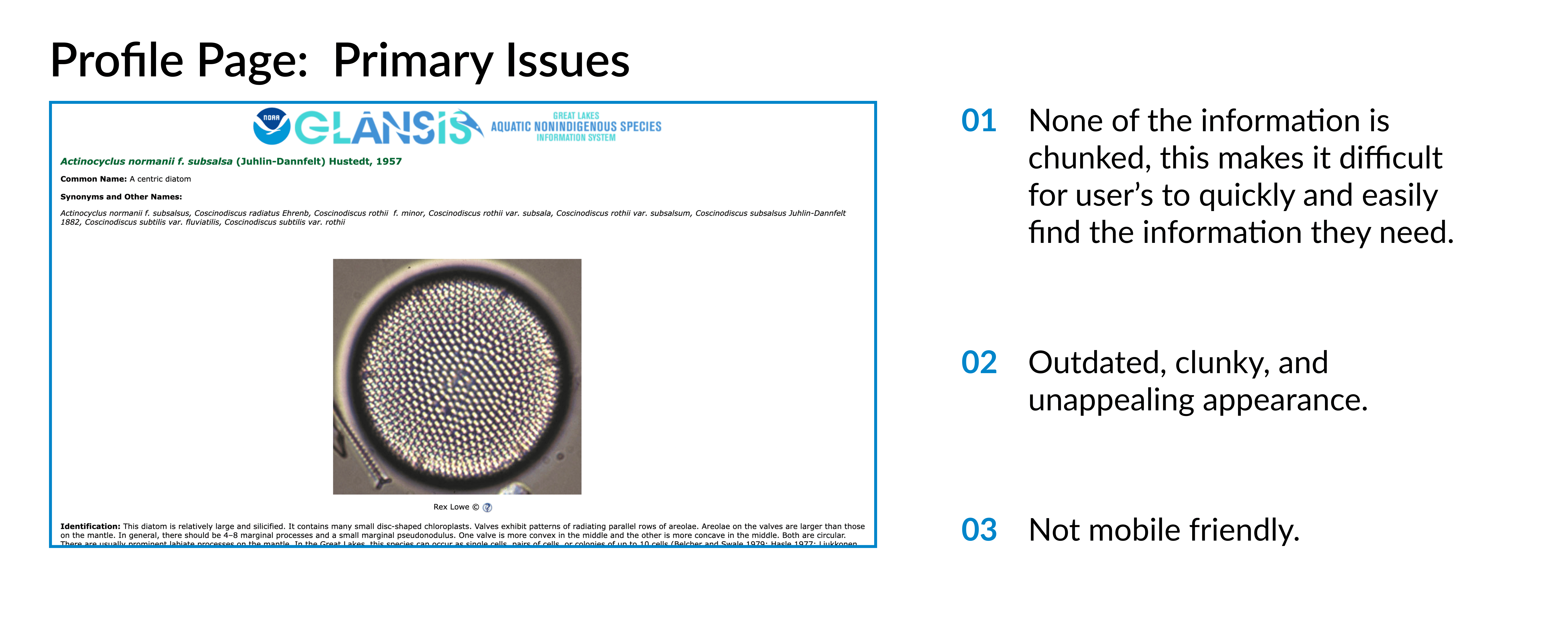
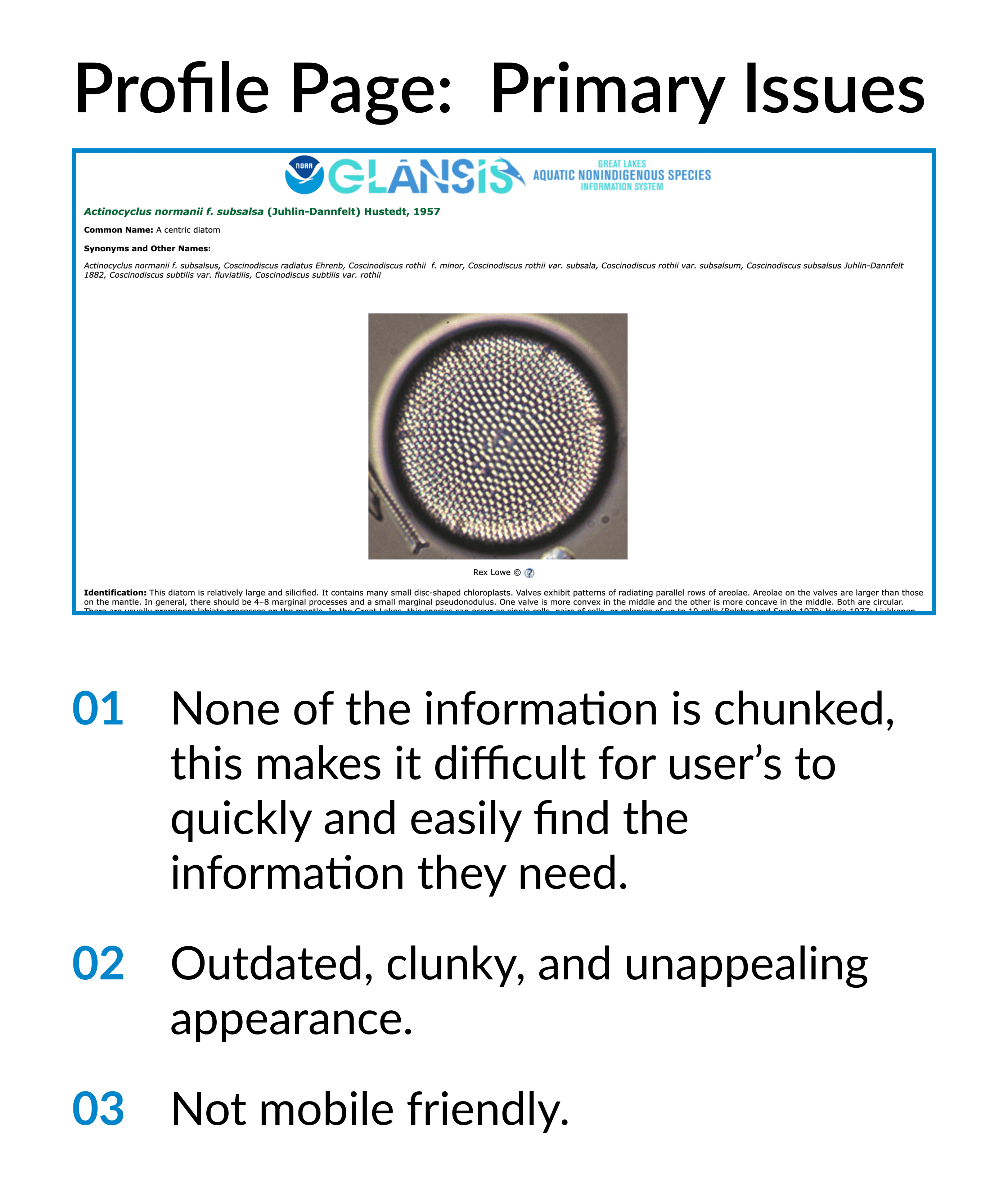
Before delving into designing a new interface, it's important to recognize the pitfalls of the original interface. I started this project by carefully going over the current issues with the GLANSIS interface, taking note of them, and using them to guide my redesign. I also read through a Heuristic Evaluation ans Usability Test conducted by Grad Students on the interface and the issues they unconvered were in alignment with the ones I took note of.
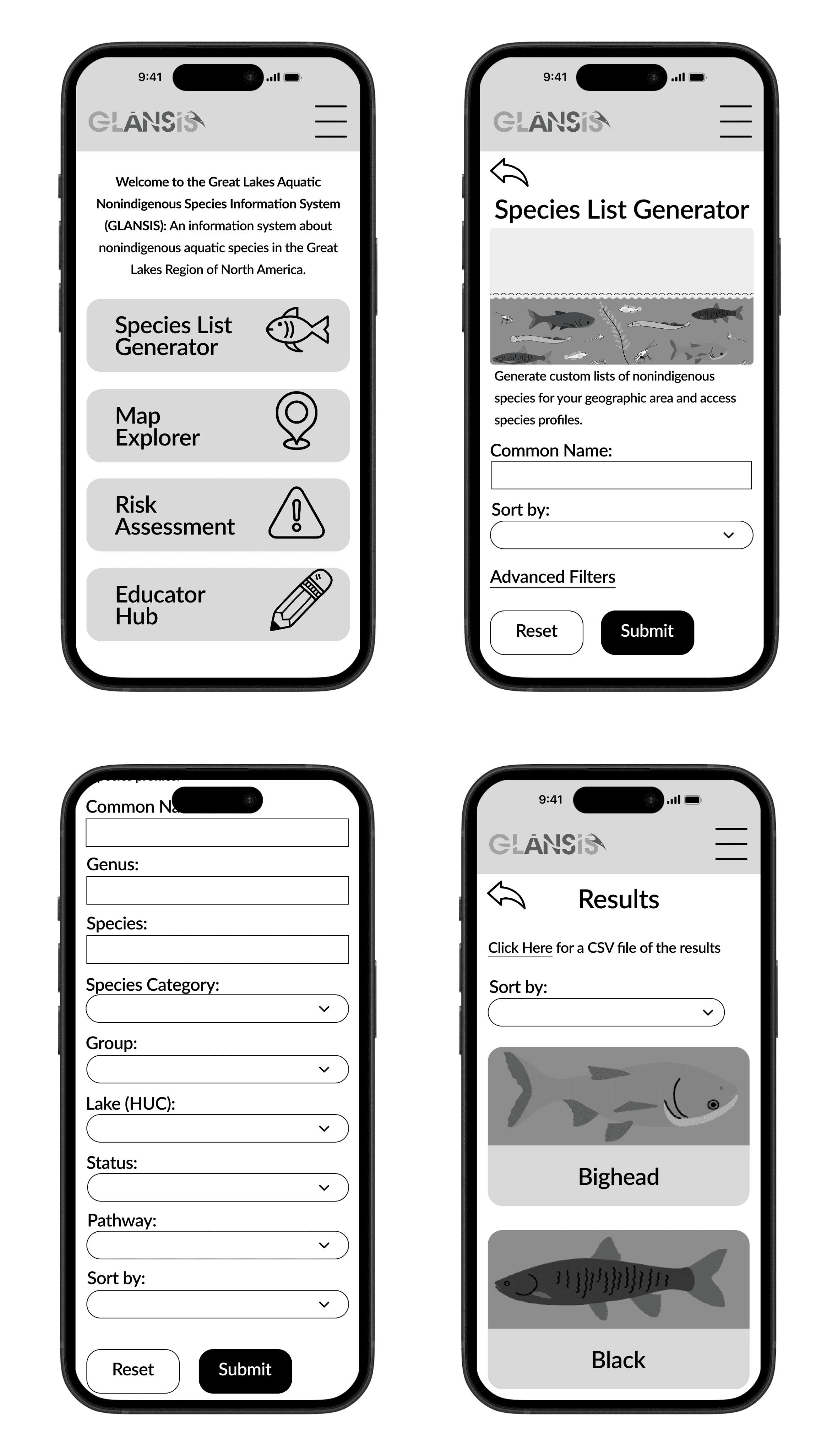
Design: First Iteration
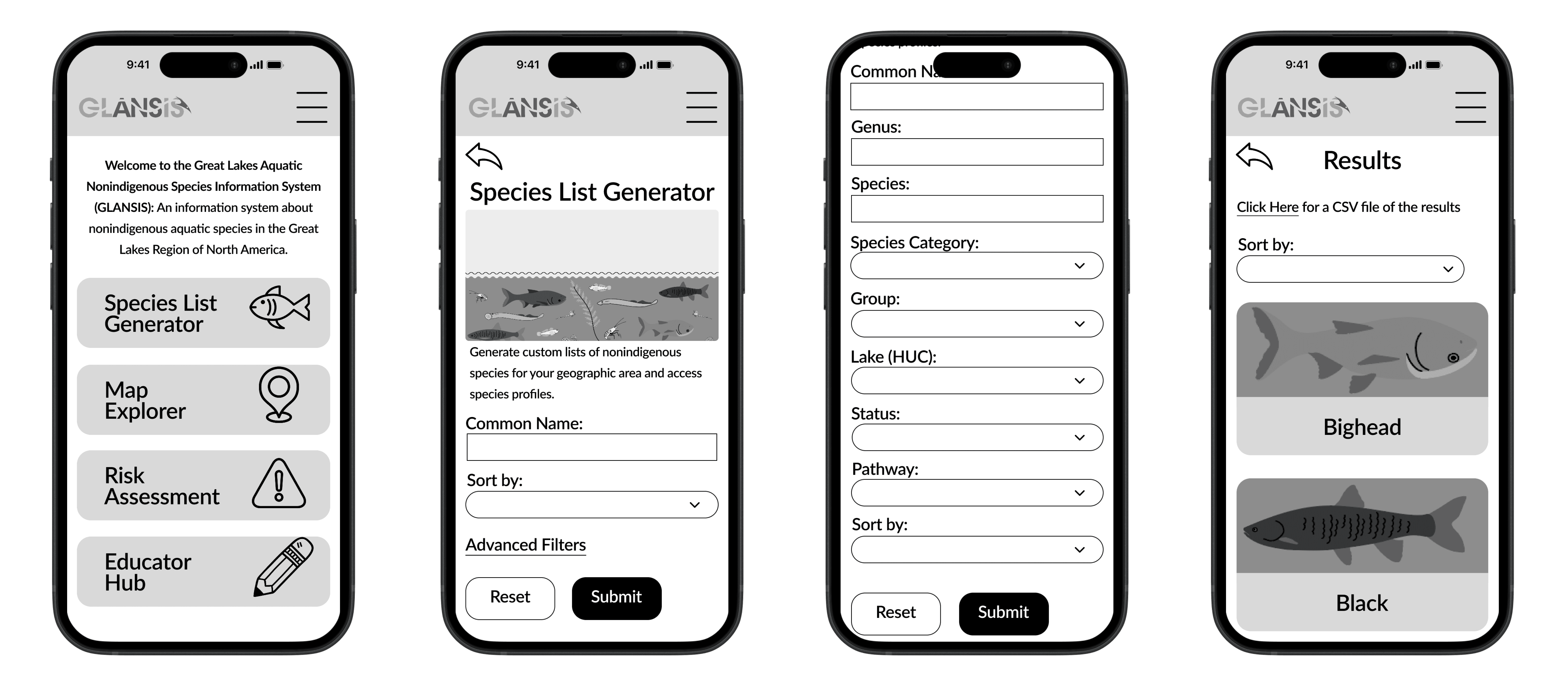
Design: Second Iteration
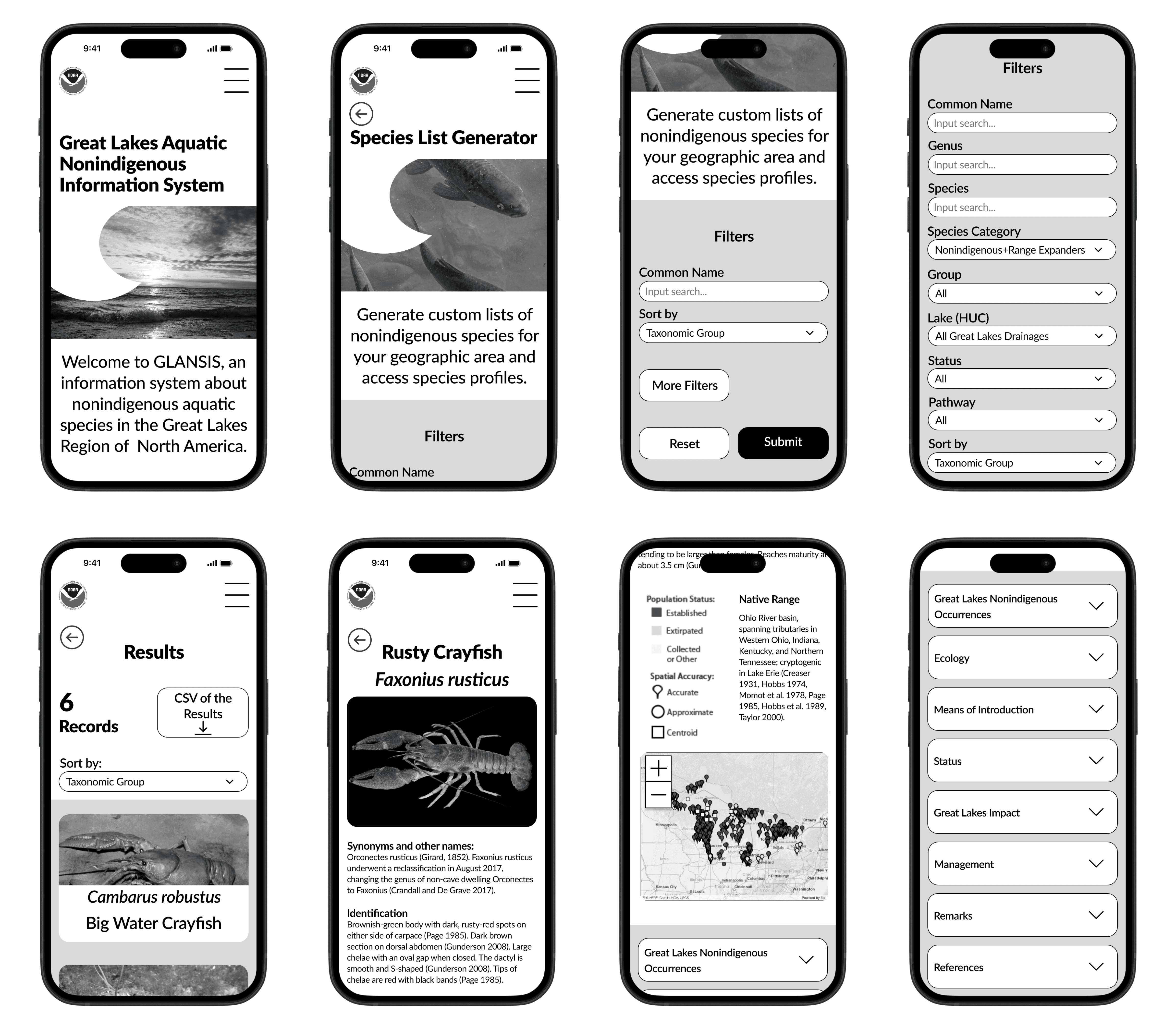
After receiving feedback on my first draft, and seeing other designer's designs, I decided that my initial design was no where near where it could be. I realized that my initial design was too "inside-the-box," I was basically repackaging the existing interface with a slightly better visual design and correcting things in regards to UX principles. I wasn't realizing the potential of the website and was making the redesign too similar to the existing design. I decided to scrap everything and start over from scratch. This time, trying to take the website in a new visual direction and innovate my design solutions.
Key Features
Clarified Results
Displays the most important information, making it easier for the user to navigate.
01
Reorganized Search
Reduces complexity and confusion by presenting the most important filters first.
02
Simplified Profile Page
Utilizes chunking to make it easier for the user to find the information they need.
03
Mobile Prototype
Desktop Prototype
Reflection
-What I Learned
That there's a certain level of complexity necessary for some products.
That it's important to take the client's feedback into consideration and to follow it.
-If I had more time, I would…
Read through all of the information on the profile pages and further chunk it.
Conduct more user tests of my prototype to see what may be confusing users.
Change the dropdown menus with less options on the Search page to buttons.
