NOAA Website Redesign
NOAA Website Redesign
NOAA Website Redesign














Discipline
UI/UX Design, Visual Design
Role
Solo UX Designer
Solo UX Designer
Timeline
Oct.-Dec. 2023
Tools
Figma, Illustrator
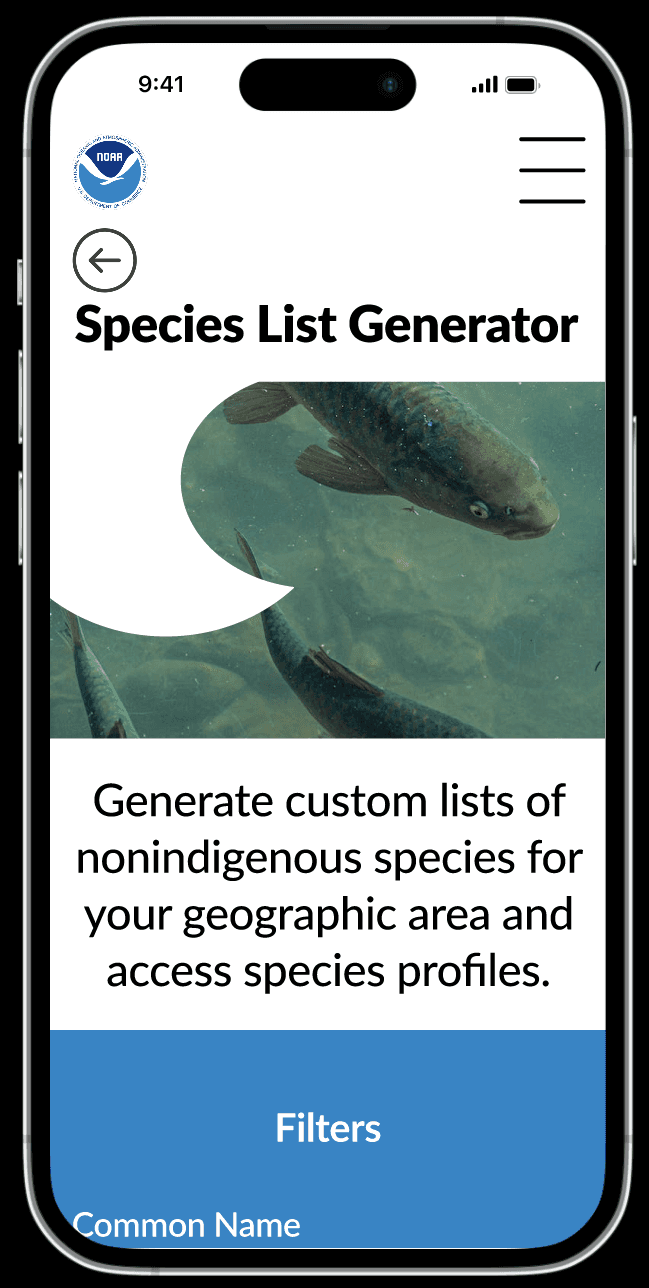
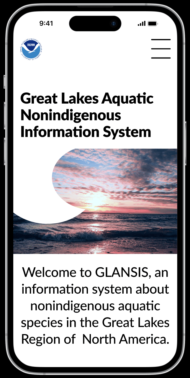
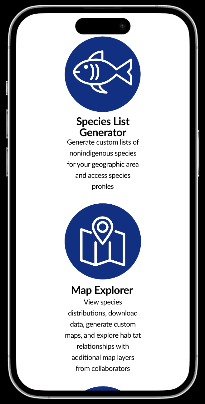
Reimagining the Species List Generator Feature for the National Oceanic and Aquatic Administration's GLANSIS Website.






Figma, Illustrator
Solo UX Designer


Project Overview
Project Overview
Project Overview
The University of Michigan School of Information partnered with the National Oceanic and Atmospheric Administration to help them redesign their GLANSIS website.
We were given the option of redesigning one of NOAA's four main tools on the GLANSIS website.
I chose to redesign the Species List Generator because it is NOAA's most important and most used tool.
The goal of this project was to solve the problems with the Species List Generator and improve upon the entire sites visual design.
About the Project
About the Project
About the Project
About NOAA's GLANSIS
About NOAA's GLANSIS
About NOAA's GLANSIS
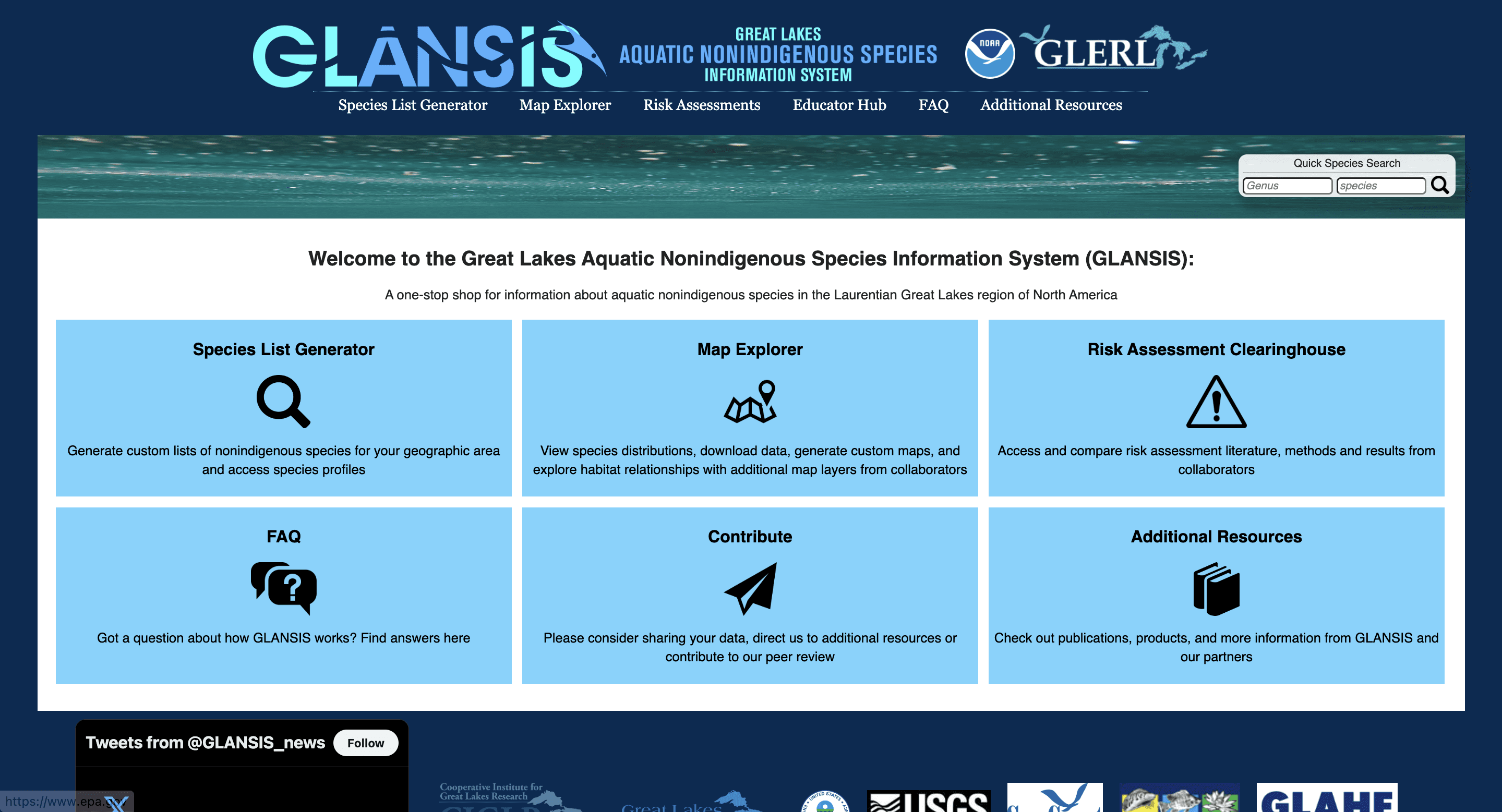
The Great Lakes Aquatic Nonindigenous Species Information System (GLANSIS), is a website created by NOAA that is an online database of nonindigenous species in the Great Lakes.
The Species List Generator is a tool on the GLANSIS website that allows you to search for a species.
The Great Lakes Aquatic Nonindigenous Species Information System (GLANSIS), is a website created by NOAA that is an online database of nonindigenous species in the Great Lakes.
The Species List Generator is a tool on the GLANSIS website that allows you to search for a species.
The Great Lakes Aquatic Nonindigenous Species Information System (GLANSIS), is a website created by NOAA that is an online database of nonindigenous species in the Great Lakes.
The Species List Generator is a tool on the GLANSIS website that allows you to search for a species.
The Problem
The Problem
The Problem
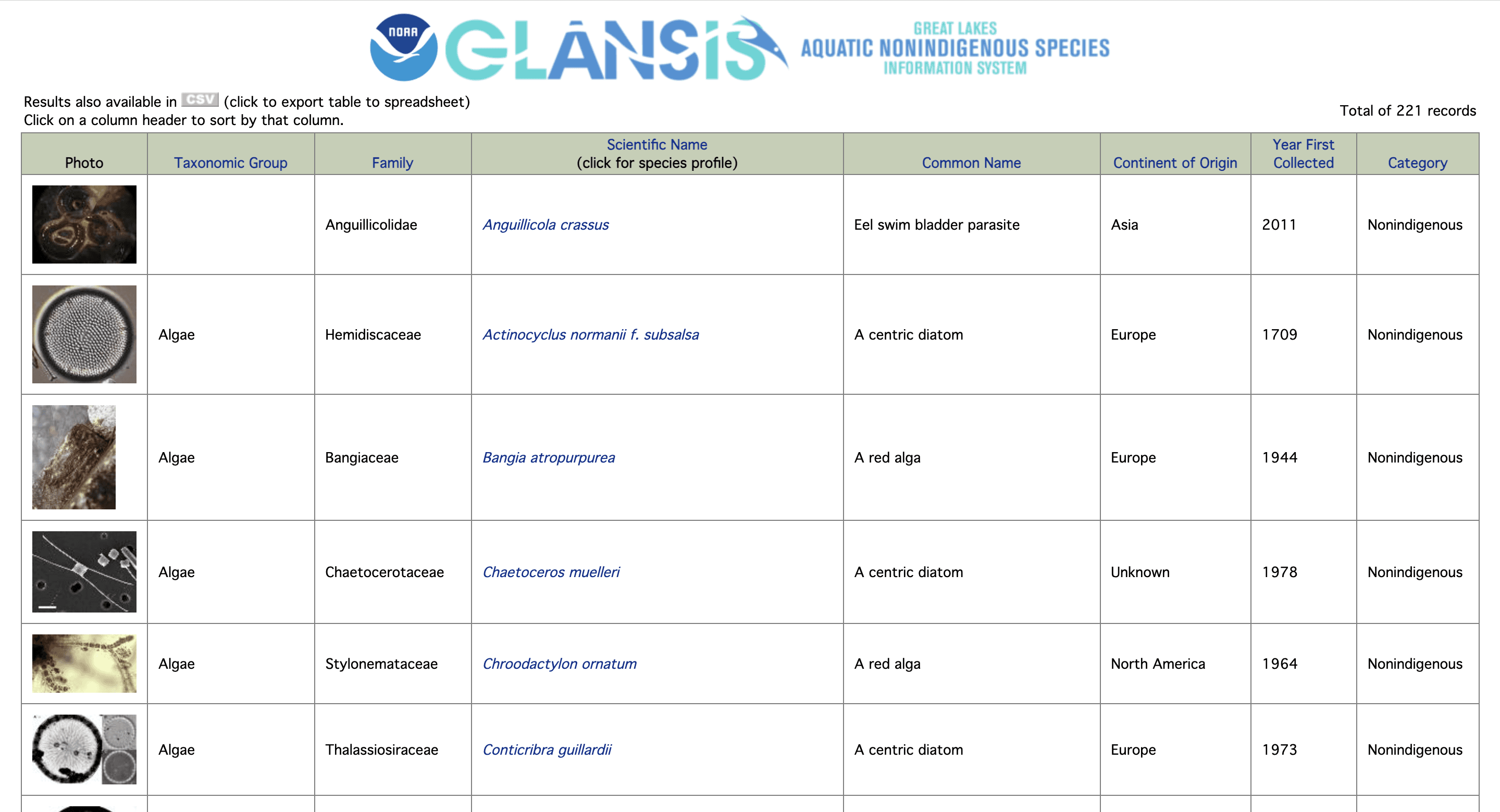
The GLANSIS websites complex and ineffectual design makes it difficult for managers, researchers, educators, and other users to navigate the website and find information relevant to them.
The GLANSIS websites complex and ineffectual design makes it difficult for managers, researchers, educators, and other users to navigate the website and find information relevant to them.
The GLANSIS websites complex and ineffectual design makes it difficult for managers, researchers, educators, and other users to navigate the website and find information relevant to them.








Project Goals
Project Goals
Redesign Results Page
Redesign the results page to prioritize necessary information and deprioritize less relevant information.
Redesign Results Page
Redesign the results page to prioritize necessary information and deprioritize less relevant information.
Redesign Results Page
Redesign the results page to prioritize necessary information and deprioritize less relevant information.
Reorganize Search Page
Reorganize the Search Page to make it less overwhelming and easier for the user to navigate.
Reorganize Search Page
Reorganize the Search Page to make it less overwhelming and easier for the user to navigate.
Reorganize Search Page
Reorganize the Search Page to make it less overwhelming and easier for the user to navigate.
Simplify Profile Page
Reorganize information on the species profile pages to make it easier for the user to find relevant information.
Simplify Profile Page
Reorganize information on the species profile pages to make it easier for the user to find relevant information.
Simplify Profile Page
Reorganize information on the species profile pages to make it easier for the user to find relevant information.
Improve Visual Design
Create a new, modern interface to make the website more minimalistic and visually appealing.
Improve Visual Design
Create a new, modern interface to make the website more minimalistic and visually appealing.
Improve Visual Design
Create a new, modern interface to make the website more minimalistic and visually appealing.
Goal 1: Redesign Results Page
Goal 1: Redesign Results
Page
Goal 1: Redesign Results
Page
Goal 1: Redesign Results
Page
Goal 1: Redesign Results
Page
PROBLEMS
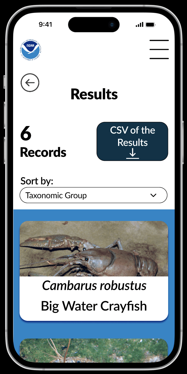
The search results page's initial design is not mobile friendly.
Too much information about each species is presented.
The page violates Fitts Law because the size of the button that the user must click on is too small.
Violates Jakob's law because the 'sort by' function does not match those used on other sites and would confuse the user.
SOLUTIONS
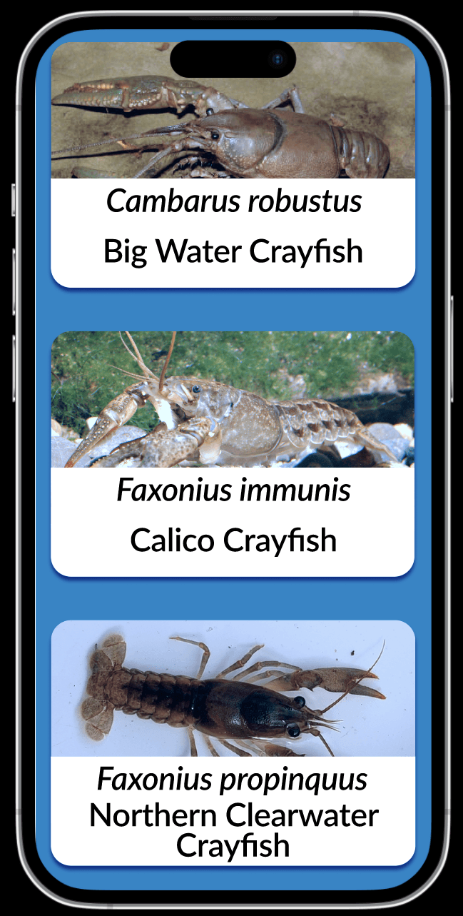
Prioritized information by only displaying the image of the species, scientific name, and common name.
Fixed the issues with Fitts Law by allowing users to click anywhere on the entry instead of just the scientific name.
Created a 'sort by' dropdown menu so the user will be able to understand how to sort their results.
Goal 2: Reorganize Search Page
Goal 2: Reorganize Search
Page
Goal 2: Reorganize Search
Page
Goal 2: Reorganize Search
Page
Goal 2: Reorganize Search
Page
PROBLEMS
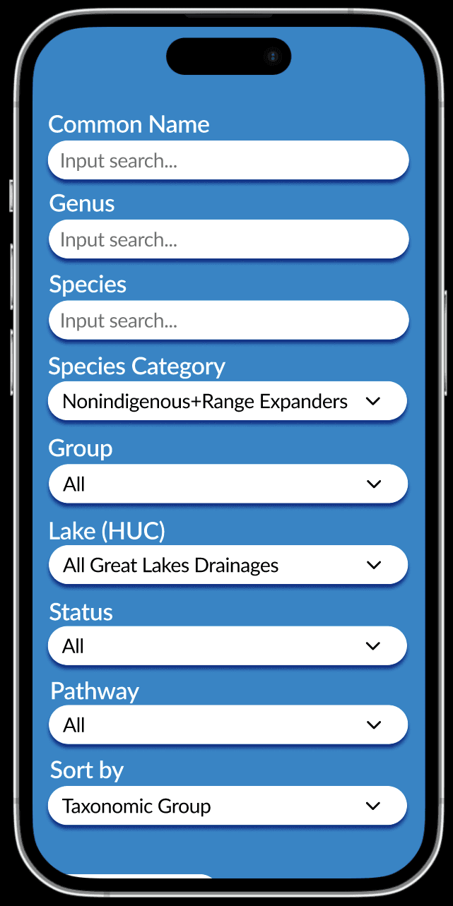
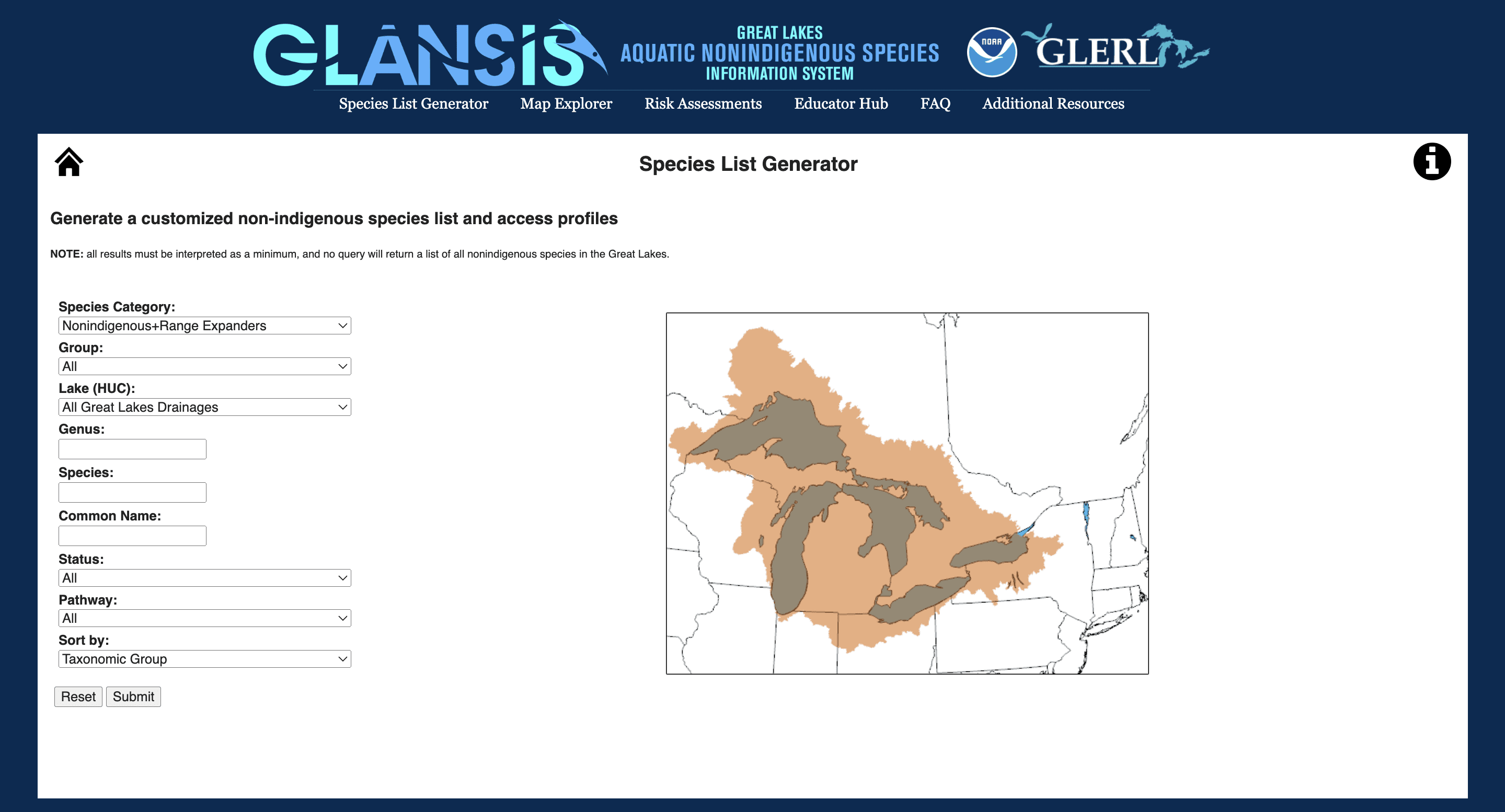
Violates Hick's Law because the number of choices overwhelms the user and increases the amount of time it will take them to make a decision.
Many of the drop down menus are misaligned.
SOLUTIONS
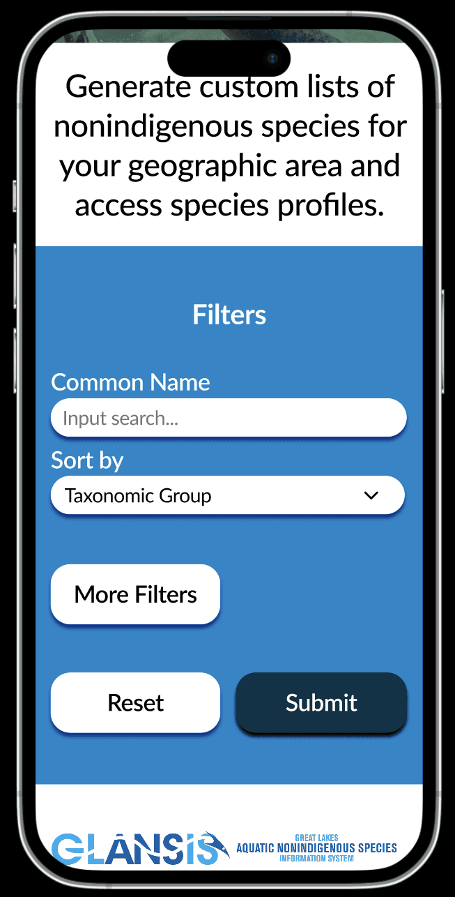
Solved the violation of Hick's law by creating a 'more filters' option wherein the user will first be presented with less options for filters and will have the choice to seek out more.
Diminished the interface's ability to overwhelm the user and allows for more user control and freedom.
PROBLEMS
The search page’s initial design is outdated, misaligned, and overwhelming. The appearance is outdated and most of the drop down menus are misaligned, making it look unorganized. Additionally, by having such a great number of filters on its initial search page, it violates Hick’s law, which states that “the time it takes to make a decision increases with the number and complexity of choices available.”
SOLUTIONS
To combat the violation of Hick’s law, I made it so the user would first be presented with just a search bar for the common name, the ‘sort by’ drop down menu, and a ‘more filters’ option. Once they click on ‘more filters’ the rest of the filters will be displayed. By having most of the filters only be displayed if the user chooses to, I diminish the interface’s ability to overwhelm the user and make it so there is more user control and freedom.
PROBLEMS
Violates Hick's Law because the number of choices overwhelms the user and increases the amount of time it will take them to make a decision.
Many of the drop down menus are misaligned.
SOLUTIONS
Solved the violation of Hick's law by creating a 'more filters' option wherein the user will first be presented with less options for filters and will have the choice to seek out more.
Diminished the interface's ability to overwhelm the user and allows for more user control and freedom
PROBLEMS
Violates Hick's Law because the number of choices overwhelms the user and increases the amount of time it will take them to make a decision.
Many of the drop down menus are misaligned.
SOLUTIONS
Solved the violation of Hick's law by creating a 'more filters' option wherein the user will first be presented with less options for filters and will have the choice to seek out more.
Diminished the interface's ability to overwhelm the user and allows for more user control and freedom.
Goal 3: Simplify Profile Page
Goal 3: Simplify Profile Page
PROBLEMS
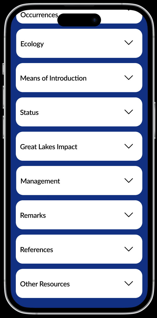
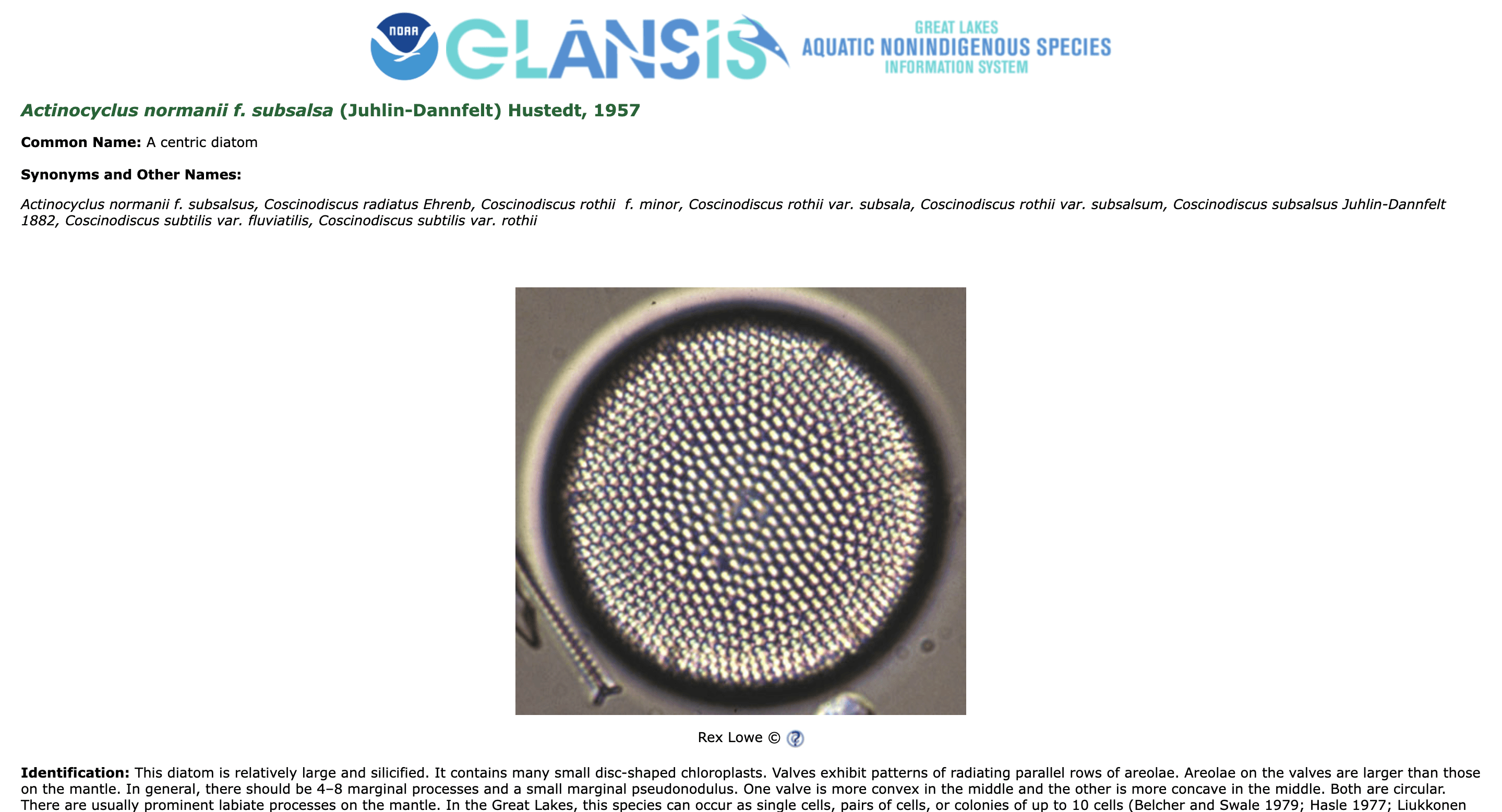
Information on the profile page is presented with no chunking or information hierarchy.
This makes it difficult for user's to find the information they're looking for.
SOLUTIONS
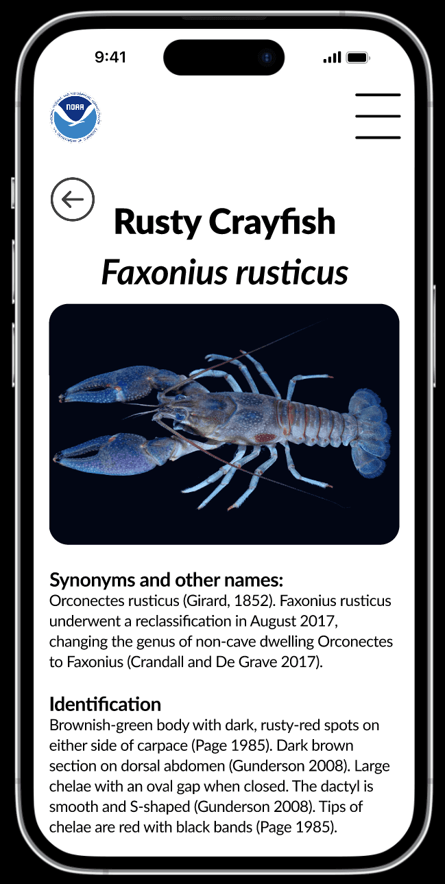
Chunked the information into dropdown menus on the mobile version.
Created a table of contents for the desktop version which allows for the user to efficiently navigate to the category of their choosing.
These changes grant the user the ability to find information more quickly and easily than before.
Goal 4: Improve Visual
Design
Final Product
Starting Over
Combined my wireframes with my style guide to create a final product that visually improves the GLANSIS interface.
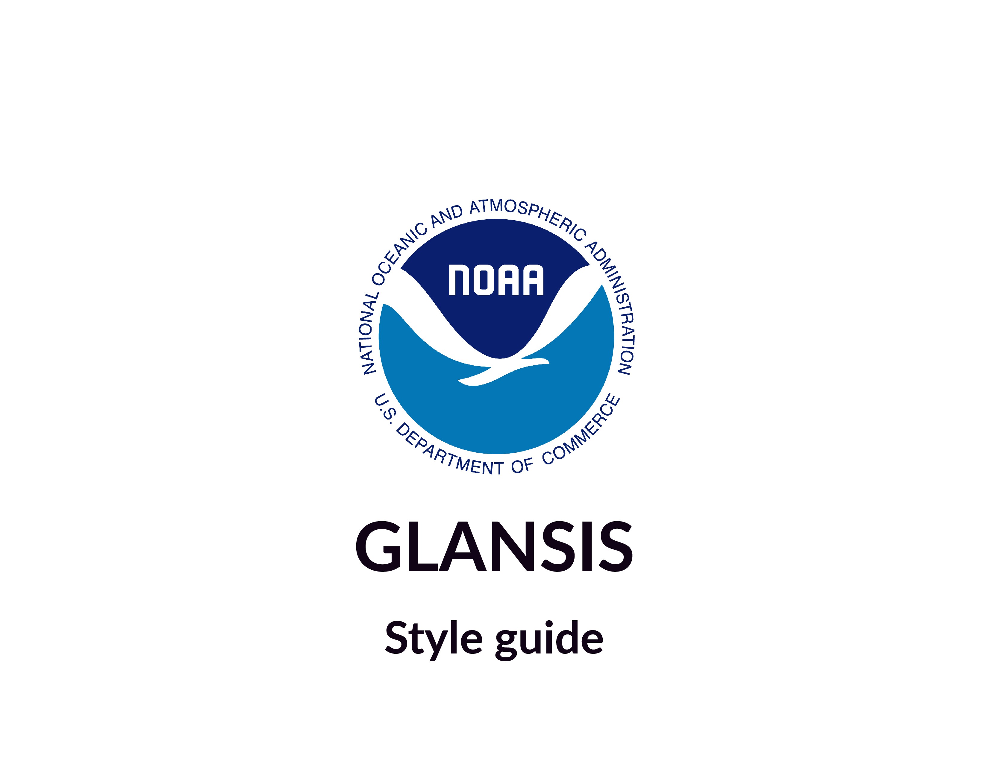
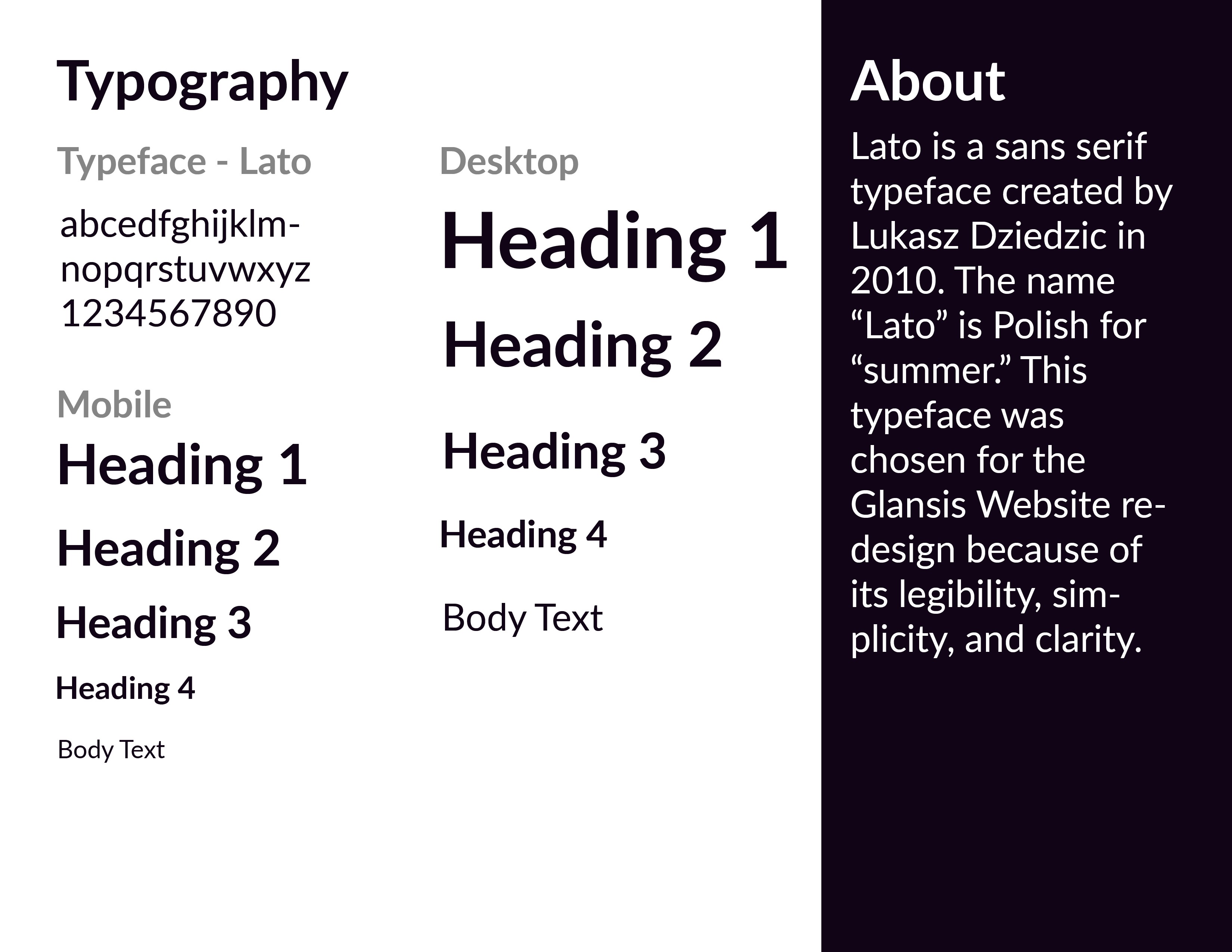
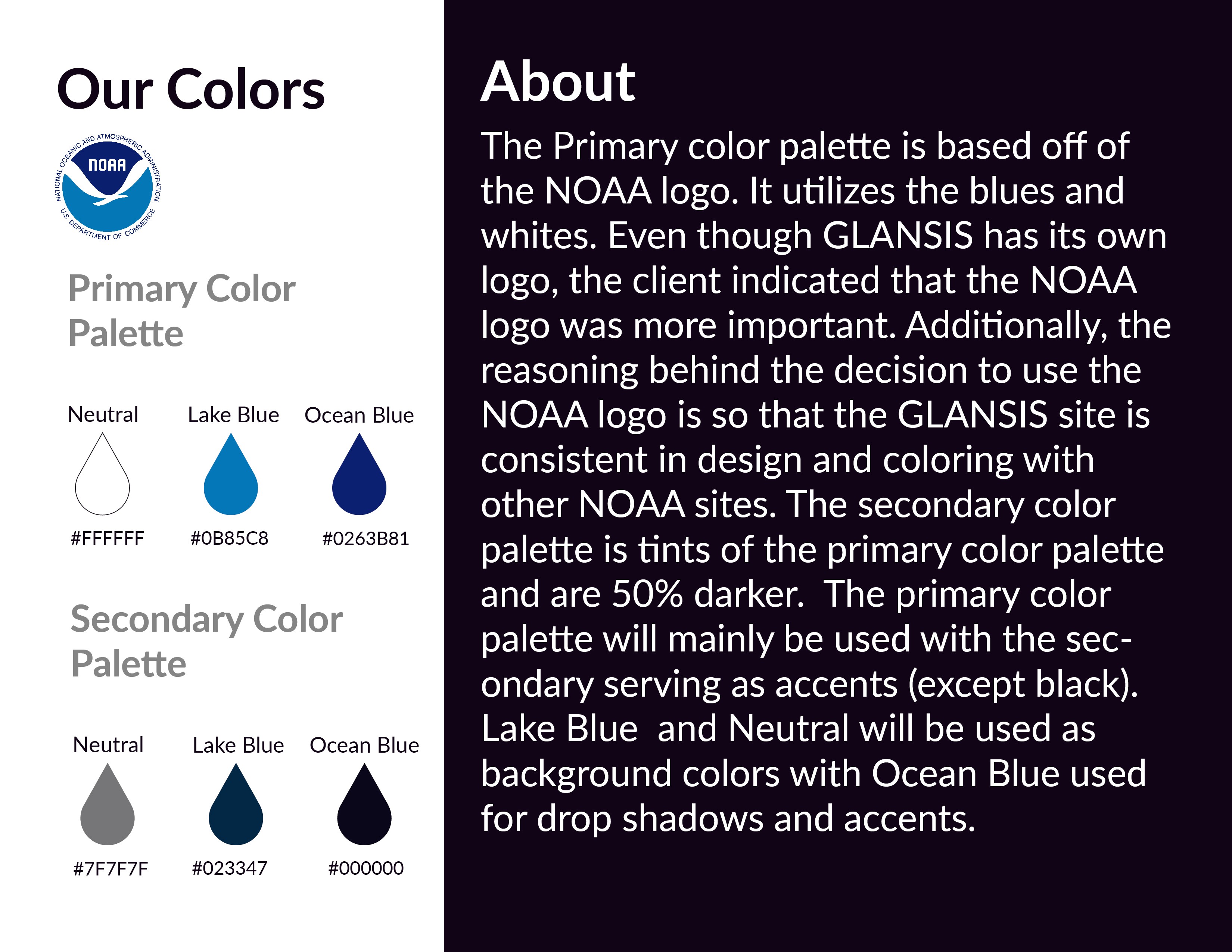
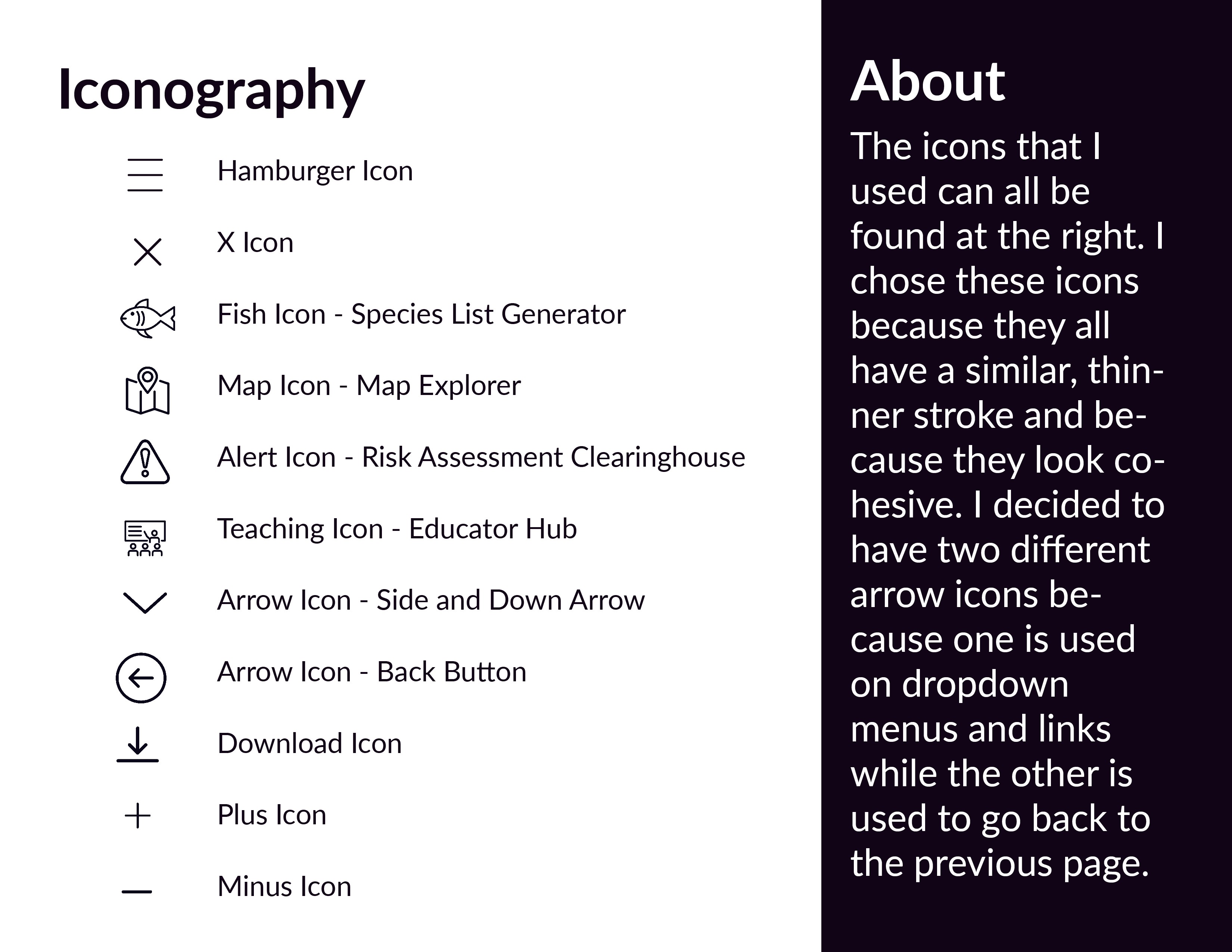
After finishing my wireframes, it was imperative to craft a Visual Identity for the product. I decided to center the visual identity around the NOAA logo so the GLANSIS site will have a clear relation to, and match visually with, other NOAA products.
NOAA's current interface is outdated and unappealing. The clients themselves said that the interface has not been updated since it was created, which was likely some time in the 2000's. One of the major goals of this project was to revamp the interface and give it a modern design.
Focused on fixing issues with the user experience of the interface and not the visual design of the interface during my first design iteration.
.
Completed the first redesign iteration and reflected on it.
Decided that my initial design, and thought process, was too 'inside the box' and didn't offer something novel in terms of visual design
First Design Iteration


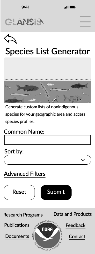
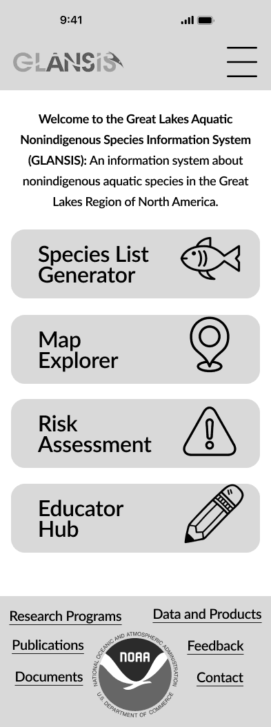
Researched and viewed several different websites for inspiration for the visual design of the interface.
Read through usability tests and heuristic reports conducted on the GLANSIS interface by grad students for further insight on what I needed to improve.
Created a new interface design that was significantly more visually appealing than my first design.


Creating a Visual Identity
Starting Over
Final Product
Goal 4: Improve Visual Design
Goal 4: Improve Visual
Design
Goal 4: Improve Visual
Design
Goal 4: Improve Visual
Design
Final Product
Starting Over
I combined by wireframes with my style guide to create a final product that I believe visually improves the GLANSIS interface.
Combined my wireframes with my style guide to create a final product that visually improves the GLANSIS interface.
Combined my wireframes with my style guide to create a final product that visually improves the GLANSIS interface.
Combined my wireframes with my style guide to create a final product that visually improves the GLANSIS interface.
After finishing my wireframes, it was imperative that I craft a Visual Identity for my product. I decided to center the visual identity around the NOAA logo so that the GLANSIS site will have a clear relation to, and match visually with, other NOAA products.
After finishing my wireframes, it was imperative to craft a Visual Identity for the product. I decided to center the visual identity around the NOAA logo so the GLANSIS site will have a clear relation to, and match visually with, other NOAA products.
After finishing my wireframes, it was imperative to craft a Visual Identity for the product. I decided to center the visual identity around the NOAA logo so the GLANSIS site will have a clear relation to, and match visually with, other NOAA products.
After finishing my wireframes, it was imperative to craft a Visual Identity for the product. I decided to center the visual identity around the NOAA logo so the GLANSIS site will have a clear relation to, and match visually with, other NOAA products.
NOAA's current interface is outdated and unappealing. The clients themselves said that the interface has not been updated since it was created, which was likely some time in the 2000's. One of the major goals of this project was to revamp the interface and give it a modern design.
NOAA's current interface is outdated and unappealing. The clients themselves said that the interface has not been updated since it was created, which was likely some time in the 2000's. One of the major goals of this project was to revamp the interface and give it a modern design.
Focused on fixing issues with the user experience of the interface and not the visual design of the interface during my first design iteration.
Completed the first redesign iteration and reflected on it.
Decided that my initial design, and thought process, was too 'inside the box' and didn't offer something novel in terms of visual design.
Focused on fixing issues with the user experience of the interface and not the visual design of the interface during my first design iteration.
.
Completed the first redesign iteration and reflected on it.
Decided that my initial design, and thought process, was too 'inside the box' and didn't offer something novel in terms of visual design
When creating the first iteration of my redesign, I mainly focused on fixing issues with the interface and not the visual design. Upon completing my initial design, reviewing feedback, and receiving more information about what is needed on the interface from my client, I took a step back and thought long and hard about how to approach this project.
I believe that my initial design had merits when it came to the design itself, but visually, it was nowhere near where it needed to be. My thought process was too inside the box and what I had created was basically just a more modern version of their current interface. I needed to start over.
Focused on fixing issues with the user experience of the interface and not the visual design of the interface during my first design iteration.
.
Completed the first redesign iteration and reflected on it.
Decided that my initial design, and thought process, was too 'inside the box' and didn't offer something novel in terms of visual design
First Design Iteration
First Design Iteration


Researched and viewed several different websites for inspiration for the visual design of the interface.
Read through usability tests and heuristic reports conducted on the GLANSIS interface by grad students for further insight on what I needed to improve.
Created a new interface design that was significantly more visually appealing than my first design.
Starting Over


After finishing my wireframes, it was imperative to craft a Visual Identity for the product. I decided to center the visual identity around the NOAA logo so the GLANSIS site will have a clear relation to, and match visually with, other NOAA products.
Creating a Visual Identity


Combined my wireframes with my style guide to create a final product that visually improves the GLANSIS interface.
Final Product


I scrapped everything I had and started over. I did research and viewed several different websites for inspiration for the visual design of my interface. I had also received feedback from the client that guided my redesign. For one, the client made it clear that the partner logos had to be included and that the footer links could not be changed.
In my original design, I got rid of the partner logos and reorganized the footer links, so in my redesign I made sure to find a way to include them in a visually appealing way. Additionally, the client stated that many users simply use the website to view the number of results generated by the Species List Generator. I had initially gotten rid of this so I made sure to include it in my redesign as well as emphasize it visually.
Researched and viewed several different websites for inspiration for the visual design of the interface.
Read through usability tests and heuristic reports conducted on the GLANSIS interface by grad students for further insight on what I needed to improve.
Created a new interface design that was significantly more visually appealing than my first design.


Starting Over
Reflection
Reflection
Reflection
That figma is suprisingly flexible and I enjoy working with it.
That there is a certain level of complexity that is necessary for certain products.
That it's important to take the clients feedback into consideration and to follow it.
That figma is suprisingly flexible and I enjoy working with it.
That there is a certain level of complexity that is necessary for certain products.
That it's important to take the clients feedback into consideration and to follow it.
That figma is suprisingly flexible and I enjoy working with it.
That there is a certain level of complexity that is necessary for certain products.
That it's important to take the clients feedback into consideration and to follow it.
What I Learned
What I Learned
What I Learned
If I had more time,
I would…
If I had more time, I would…
If I had more time, I would…
If I had more time, I would…
If I had more time, I would…
If I had more time, I would…
Read through all of the information on the profile pages and further chunk it.
Conduct more user tests of my prototype to see what may be confusing to users.
Change some of the dropdown menus on the Search page to buttons with each menu item since some of the categories don't have that many options.
